HI GUYS! Welcome to yet another amazing feature in #TheTonkaHouse, the office! We were so excited to get our hands dirty and update this previously dated space!
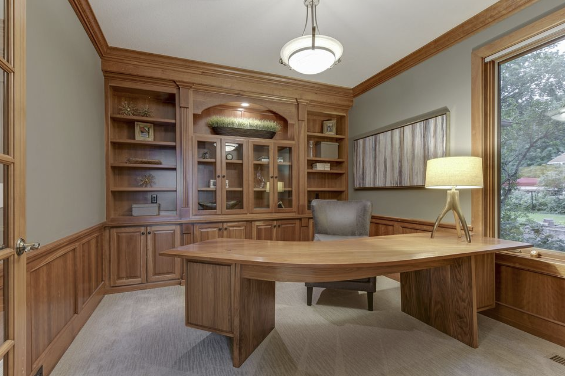
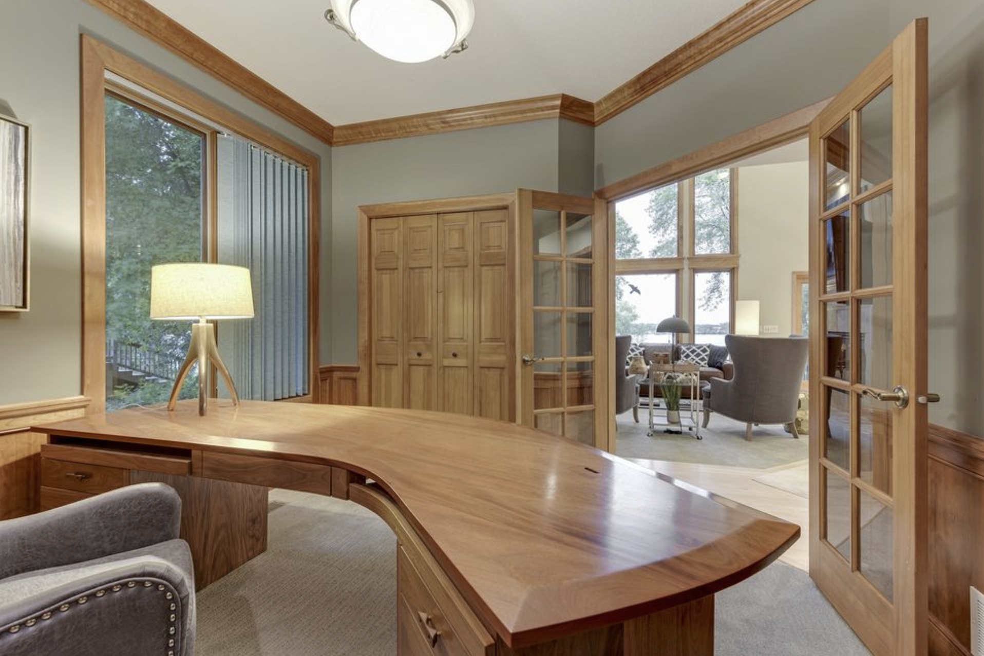
As you can see in the first image below, the office space before remodel was nothing special and definitely wasn’t screaming chic and sophisticated!
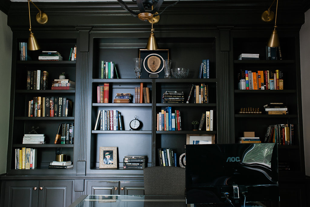
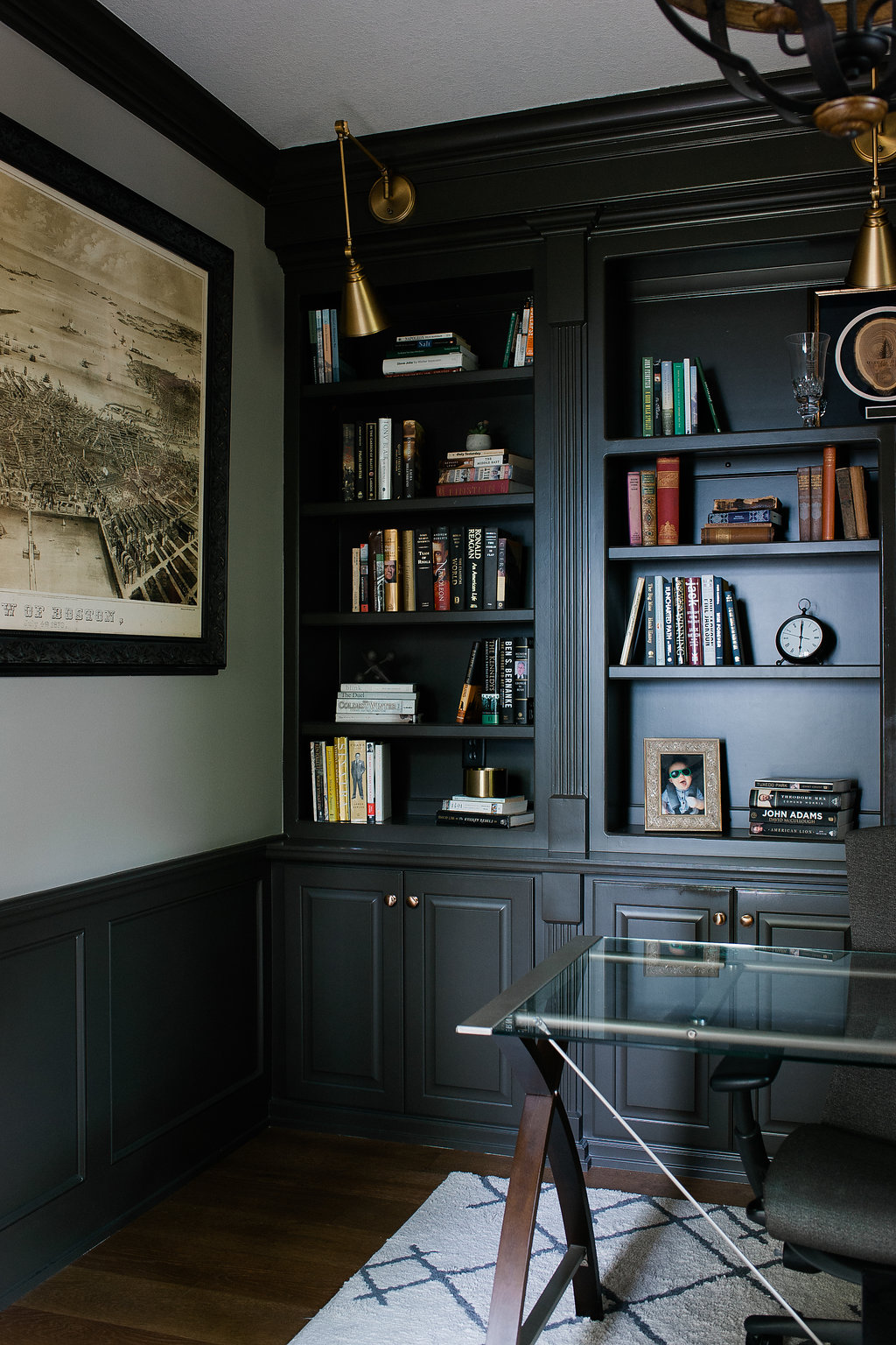
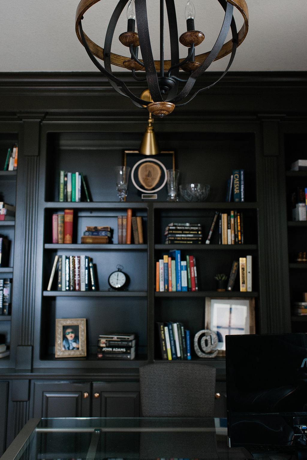
First things first, we ripped out the carpet and replaced it with hardwood flooring to match the living room and entryway. For the back wall, we wanted to redesign the built-in unit with an updated look and accessible shelving. To do this, we removed the center glass cabinet doors and reconfigured the shelving. We also removed the arch from the center of the unit to create a more contemporary, linear look.
We painted everything and installed antique brass sconces to add a pop of interest and additional lighting. A little design hint: make sure you have enough lighting in your space. This means layer your lighting. It’s always better to have “too much” light than not enough.
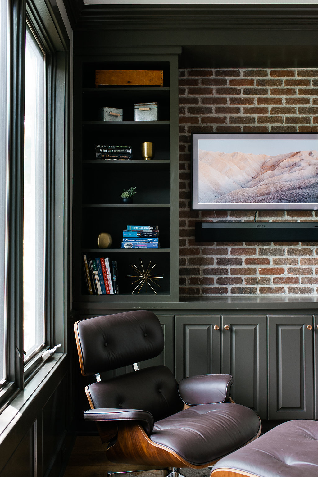
 On the opposite end of the room, we redesigned what used to be a closet into another built-in cabinet/storage unit and T.V. area. To add some texture, we used a thin brick backsplash behind the T.V. area.
The dark finishes and gold accents give this room a bold, masculine look that is perfect for a home office!

Photography: Melissa Oholendt Photography


Thanks for sharing this information about the Tonkahouse office reveal. I really wanted to explore topics like this.
Thanks for sharing. I read many of your blog posts, cool, your blog is very good.