Moody paint colors are having *a moment* in interior design, and we are here for it! From deep green to timeless black, we’ve rounded up five of our favorite rich, moody hues. Read on for a daily dose of colorful inspiration and to learn a few tips to ensure your newly painted interior is rich and beautiful instead of dark and drab.

Benjamin Moore 2135-20: Stonecutter
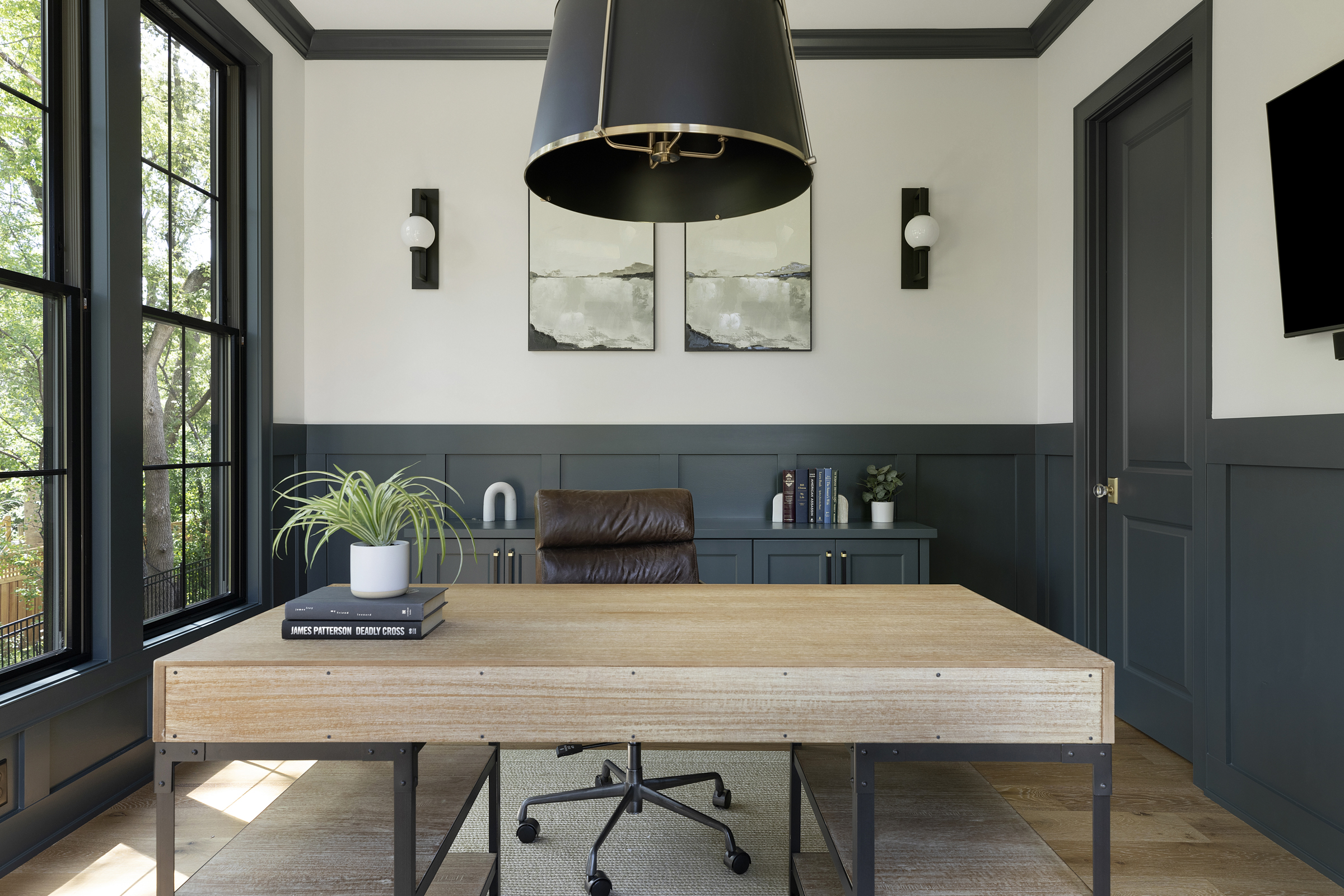
Stonecutter is dark and deep hue found just few steps away from black on the good ol’ color wheel. Seeped in tones of teal and slate, we love how it brought contrast into the #bloomingtonbuild office shown below. If you’re intimidated by using moody paint colors, start by using smaller elements of color in a space, such as painting the cabinets or wainscoting a darker shade, like we did here.
Sherwin Williams 6258: Tricorn Black
Black has entered the chat. Timeless, classy, and oh-so modern, we love painting both exteriors, interiors, and even trim black. Tricorn Black is a true black, meaning it works with any undertone (score!), and it has an Light Reflective Value (LRV) of 3 which is super low. Based on a scale of 0 (pure black) to 100 (pure white), an LRV of 3 means that the color only reflects 3% of light making it a very deep black. We painted the vanity in the #pinegroveproject basement bathroom Tricorn Black, so it could serve as an accent piece and balance out the rest of the modern, black and white space!

Benjamin Moore 2131-20: Midnight
Technically considered “a decadent shade of black” according to Benjamin Moore, a faint trace of greens keeps this shade from being considered a pure black. We love the balance this deep, rich hue brings to the #bloomingtonbuild mudroom and how the brass hardware shines against the dramatic Midnight color.

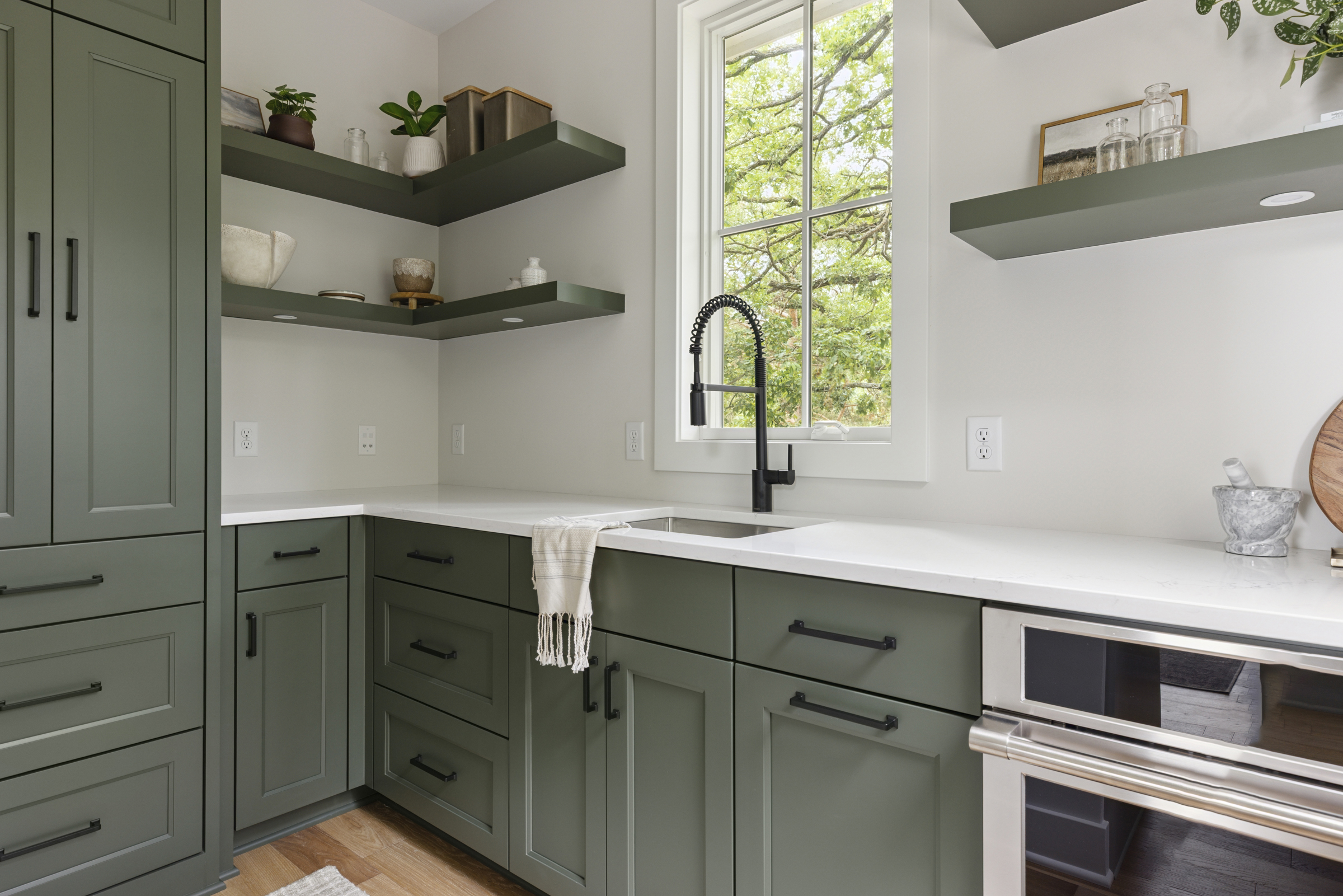
Benjamin Moore CC-630: Backwoods
Green hues are reminiscent of nature, making them calming and comforting. And dark green hues are no exception! Backwoods by Benjamin Moore is a great moody green choice. It’s a classic, timeless color that complements white, gray, and wood finishes. We love the serene feeling it brings to spaces, making it the perfect addition to #simplynorthernroots‘ nursery.

Benjamin Moore HC-167: Amherst Gray
A dark gray like Amherst Gray can also be considered moody. This warm, charcoal gray has subtle green undertones, but remember, as with all paint colors, the lighting and surrounding elements like backsplash, wall color, and floor color can all impact the hue’s appearance and balance out the green undertones. Amherst Gray cabinets, white backsplash, and matte black hardware combine to create a harmonious blend in #theowlsnest kitchen, shown below.

Our Favorite Hardware to Pair with Moody Paint Colors
When pairing hardware with moody-colored cabinets we tend to go one of two ways. 1.) Picking a contrasting metal finish that pops like brass or polished nickel or 2.) using a darker colored finish – typically matte black – for a more streamlined, sleek look. Shop some of our favorite hardware for both options – brass or matte black – below!
Our Favorite Brass Hardware to Pair with Moody Paint Colors

Our Favorite Matte Black Pulls to Pair with Moody Paint Colors

We hope you’re feeling inspired to try a bit of moody color in your home after reading this post! And, if not, we’re going to toss in just a few more reasons to love these full-bodied hues. Dark dramatic shades pull you in and can be cooling in warmer months and cozy in the cooler months. They can be lightened up by working in artwork, furniture, or light fixtures that are lighter shades. And they ooze moody sophistication, an aesthetic we love.
As always, hop on our email list for the latest and greatest resources from Alma Homes, and check out our other helpful paint-related blog posts below.
More Paint Posts
THE BEST GREY-GREEN PAINT COLORS FOR YOUR HOME
HOW TO CHOOSE THE RIGHT PAINT COLOR FOR YOUR SPACE
THE BEST NEUTRAL PAINT COLORS FOR YOUR HOME
THE BEST WHITE PAINT COLORS FOR YOUR HOME
Love our website? Use code ALMAHOMESSENTME for 10% off any Tonic Site Shop website template.