


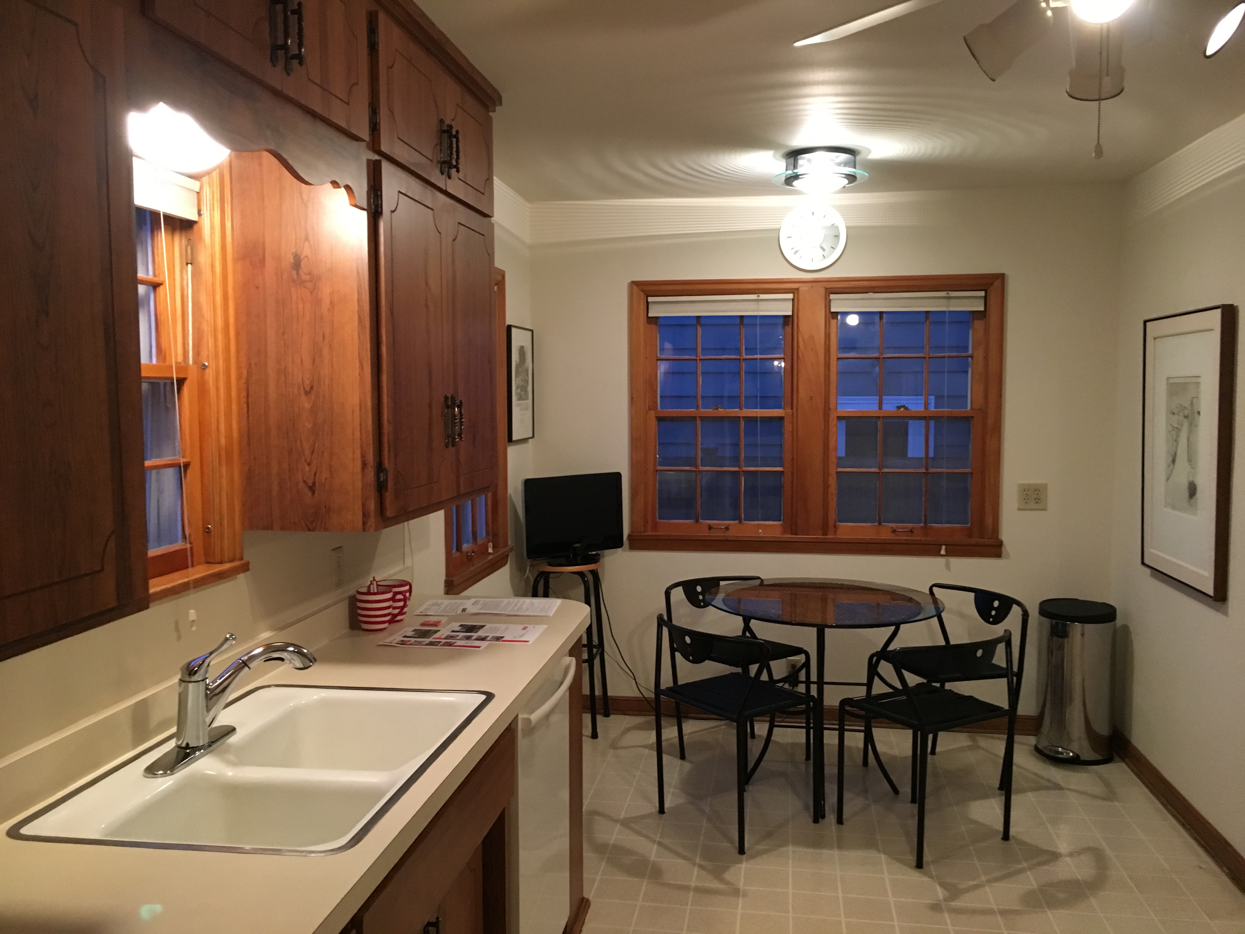
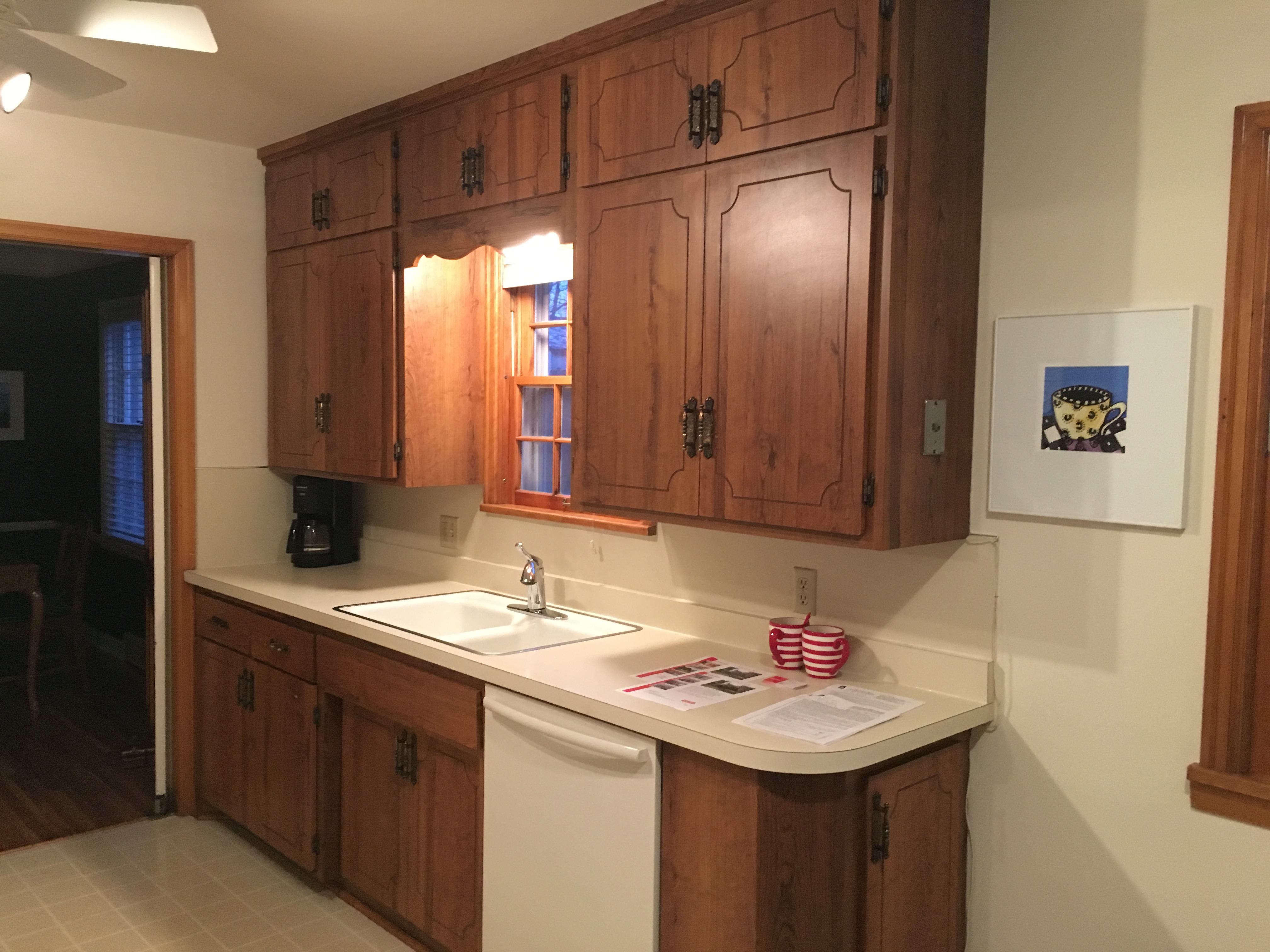
When we first saw #thehighlandshouse kitchen, we were met by outdated cabinetry and appliances, worn out laminate flooring, and dingy formica countertops…cue the 1940’s music please. I’m not going to lie, this kitchen put me through the ringer, and I can’t tell you how many different layouts I created before we finally landed on the final result.
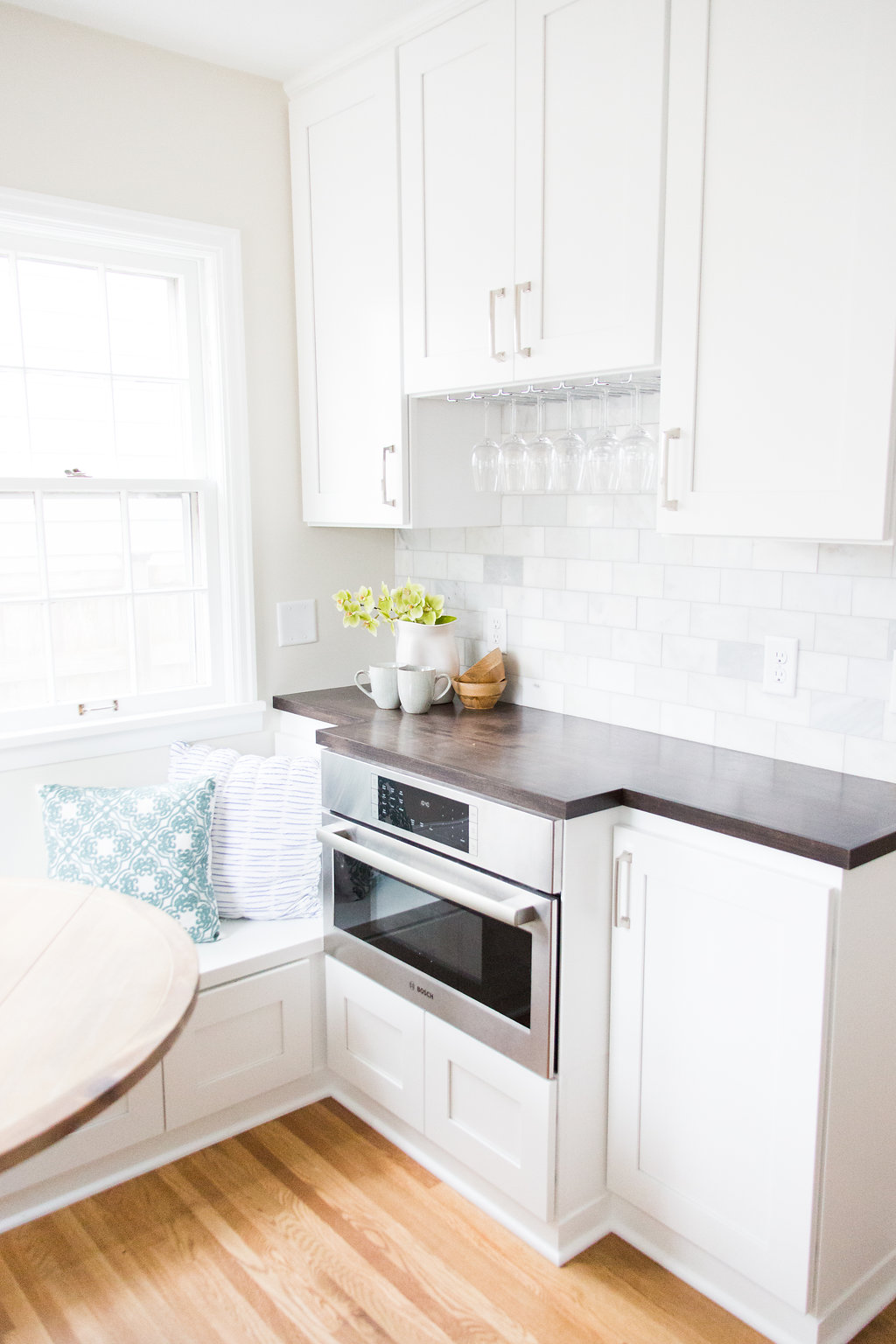 The original layout was less than ideal. I wanted to find a way to open it up to the rest of the house, but I didn’t want to sacrifice precious storage space. I wanted to create a place to gather in the kitchen (since that’s where people always tend to be), but with such limited square footage, it posed to be quite difficult. We ended up creating a built-in breakfast nook to allow people a place to hang out and sit in the kitchen, while still staying out of the way of whoever was cooking.
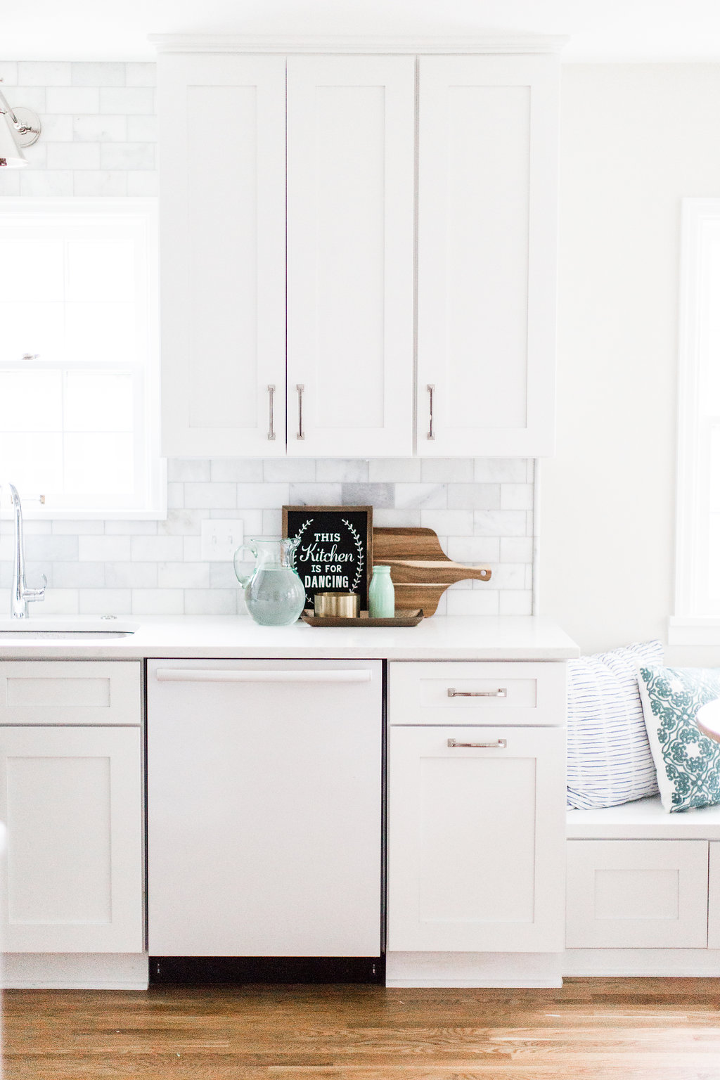
We used wall cabinets under the bench in the breakfast nook because we wanted to maximize storage as much as humanly possible. And do you see that Bosch appliance above near the wine glasses? That’s actually a convection microwave. We decided to use that because it functioned as both a microwave and and oven, so it allowed for a second cooking space in the kitchen, without having to sacrifice the space for a double oven.
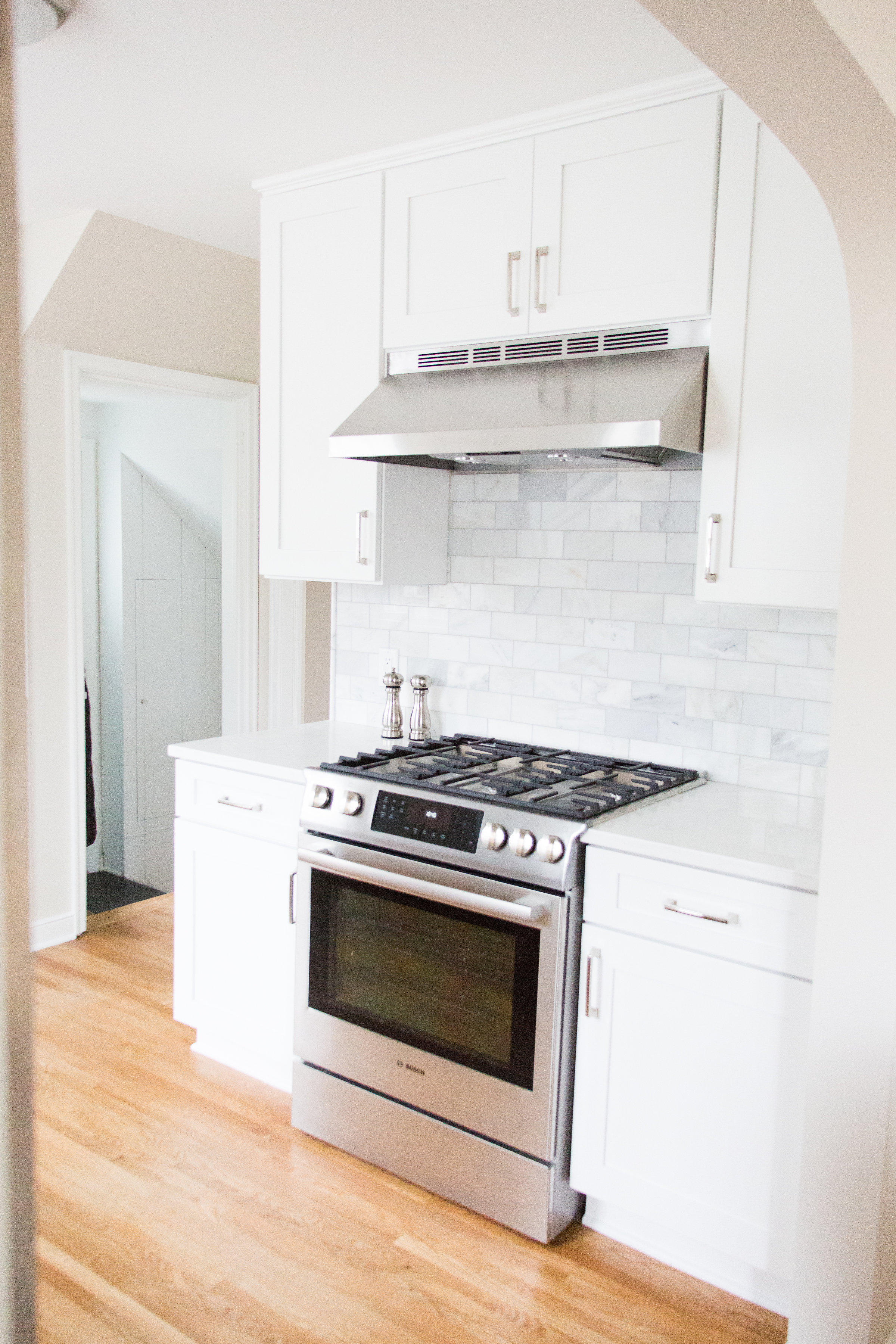
 On this wall, we decided to keep the plumbing where it was to save costs. However, we did end up moving the fridge over next to the sink to clear up space for a countertop on either side of the range.

 That was definitely one of my pet peeves about the original kitchen – there was nowhere to put anything when you were cooking! Moving the fridge to the other wall helped solved this problem, and also made the kitchen feel a lot larger.

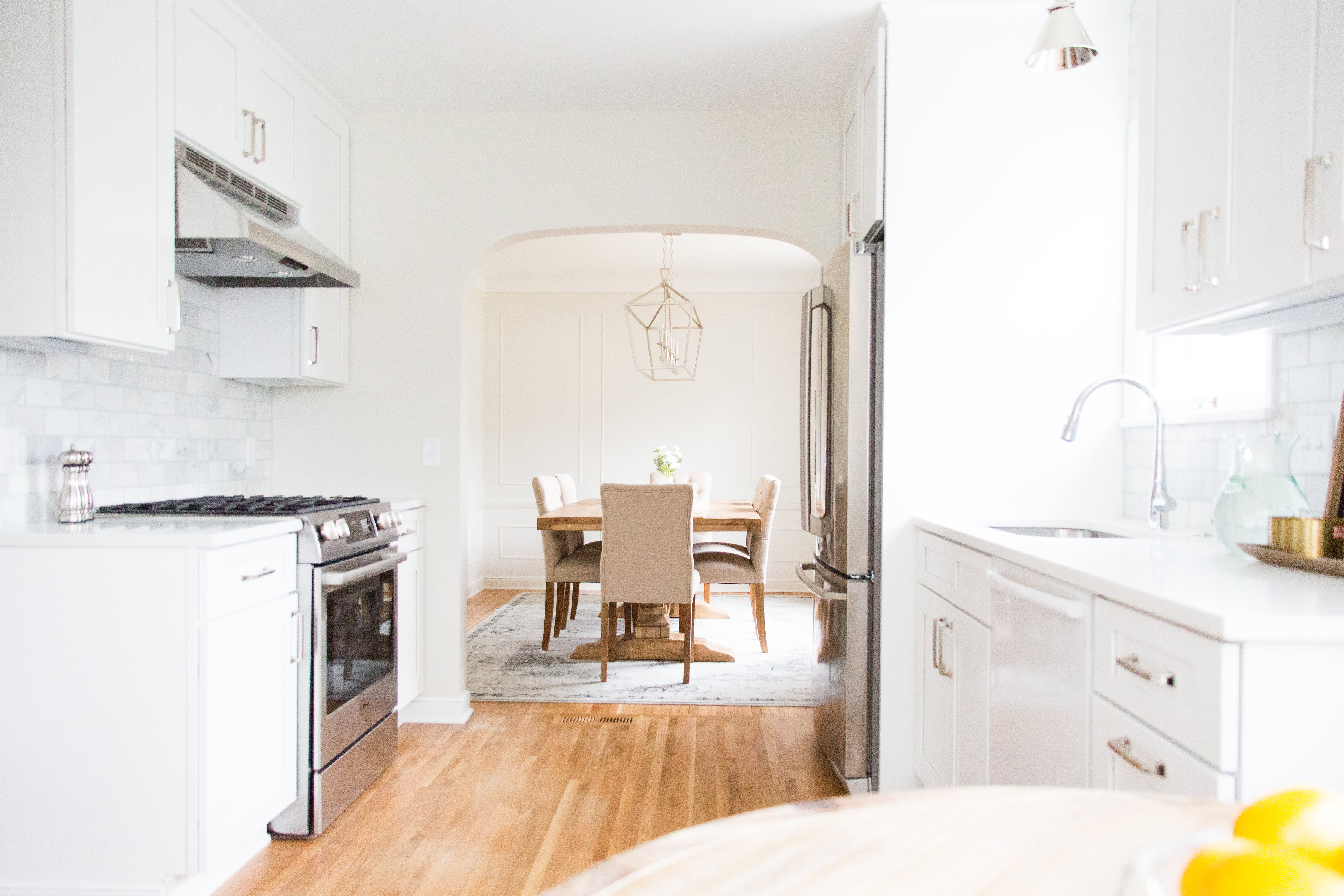
In an attempt to help the kitchen feel more connected to the rest of the house, we opened up the wall that led to the dining room and added an archway that matched the others in the house. This by far was one of the best moves because it flooded light into the kitchen and made it feel twice the size.
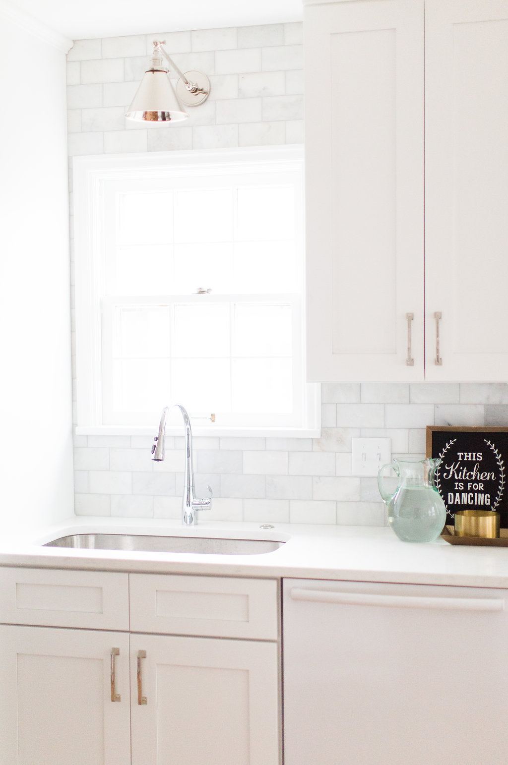
From a material standpoint, we removed all the linoleum floors and added new hardwood flooring to tie in with the existing hardwood in the other rooms. We used a 3×6 marble tile on the backsplash, and opted for a quartz that resembled marble for the countertops.
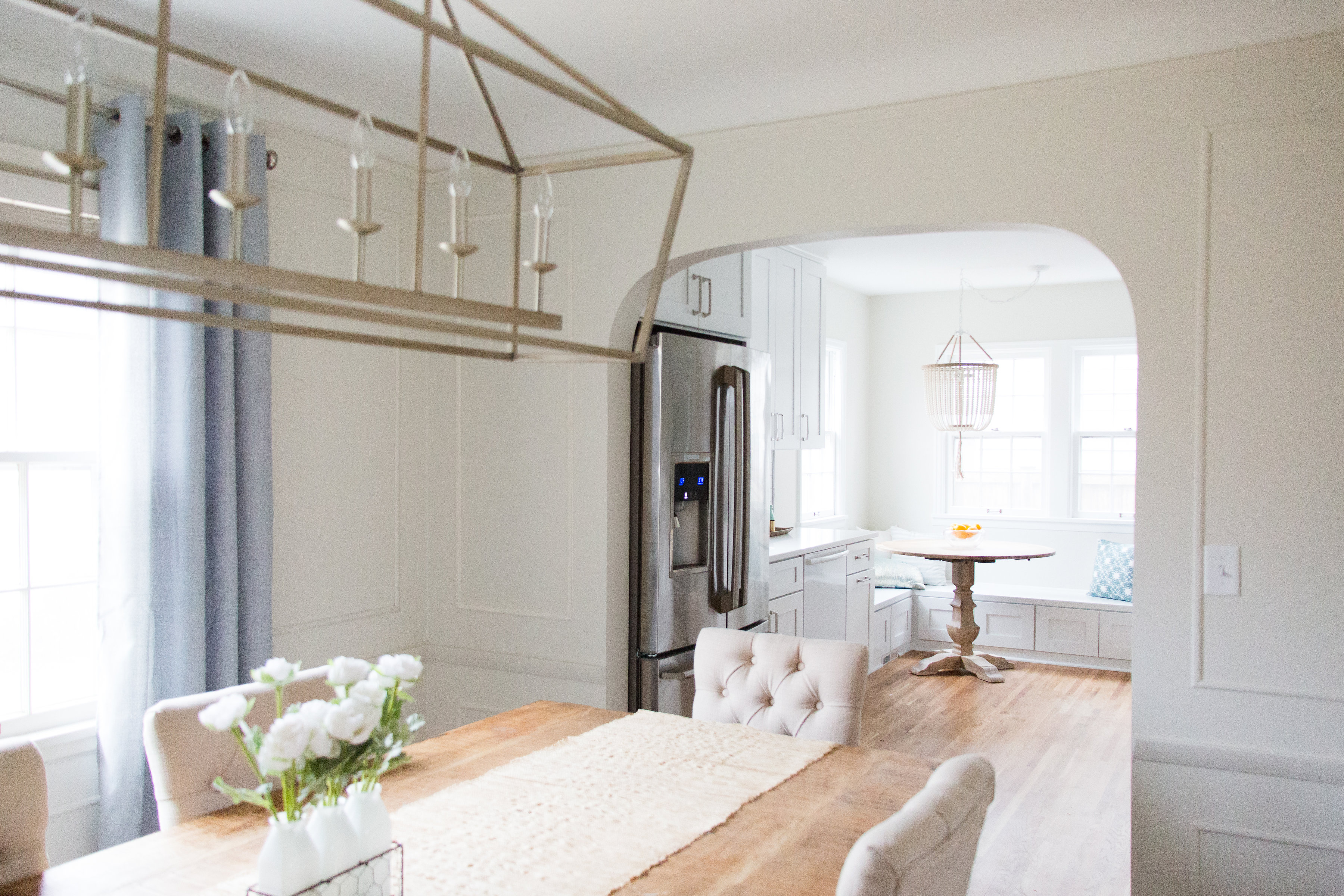
You can see what a huge difference it made by opening up that wall from the dining room to kitchen.
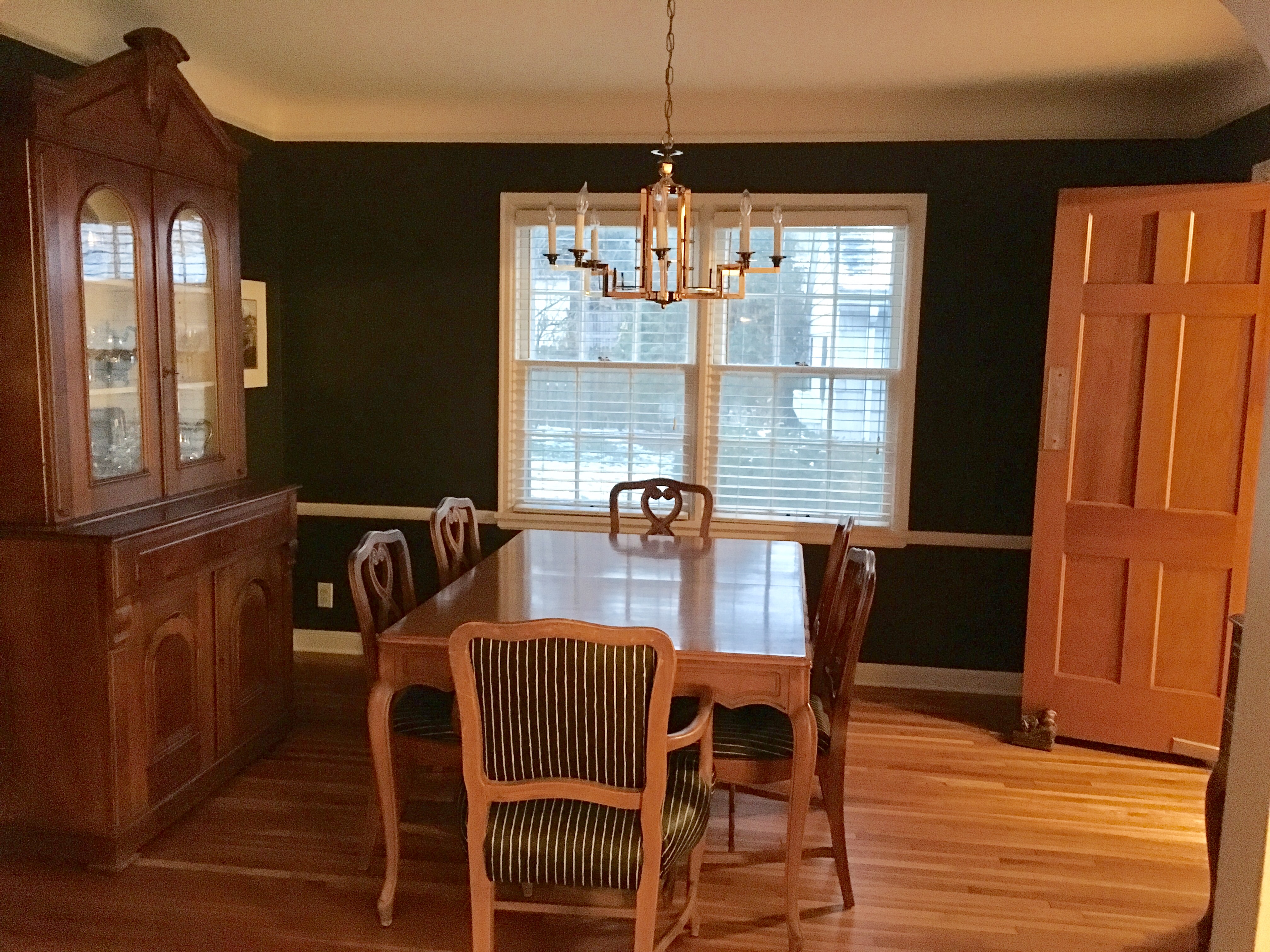
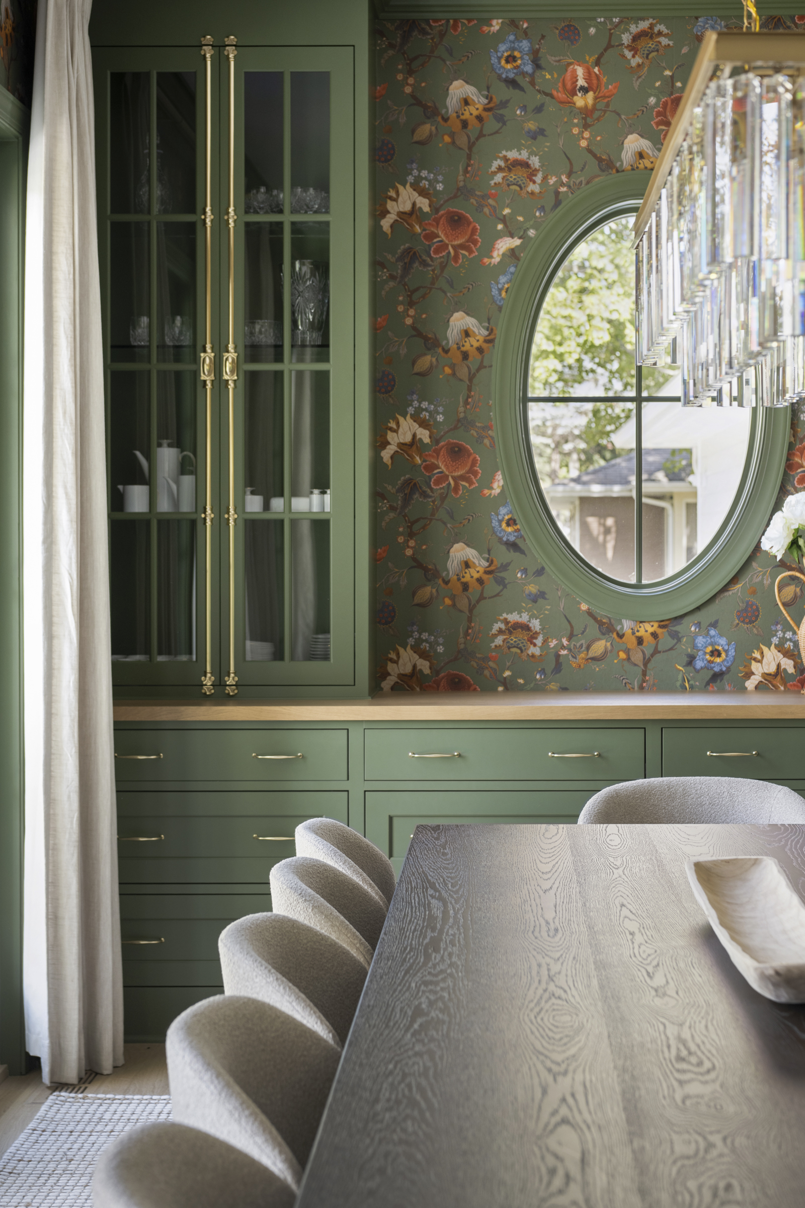
 The dining room had far less work for us. We added an applied moulding on the walls to give them a little character, and painted the walls in a lighter color to make it seem larger. Once that was complete, all we had to do was replace the light fixture, add some furniture, and this space was sparkling.
Don’t you just love a good before and after?!


Thank you for your sharing. I am worried that I lack creative ideas. It is your article that makes me full of hope. Thank you. But, I have a question, can you help me? https://accounts.binance.com/tr/register?ref=WTOZ531Y