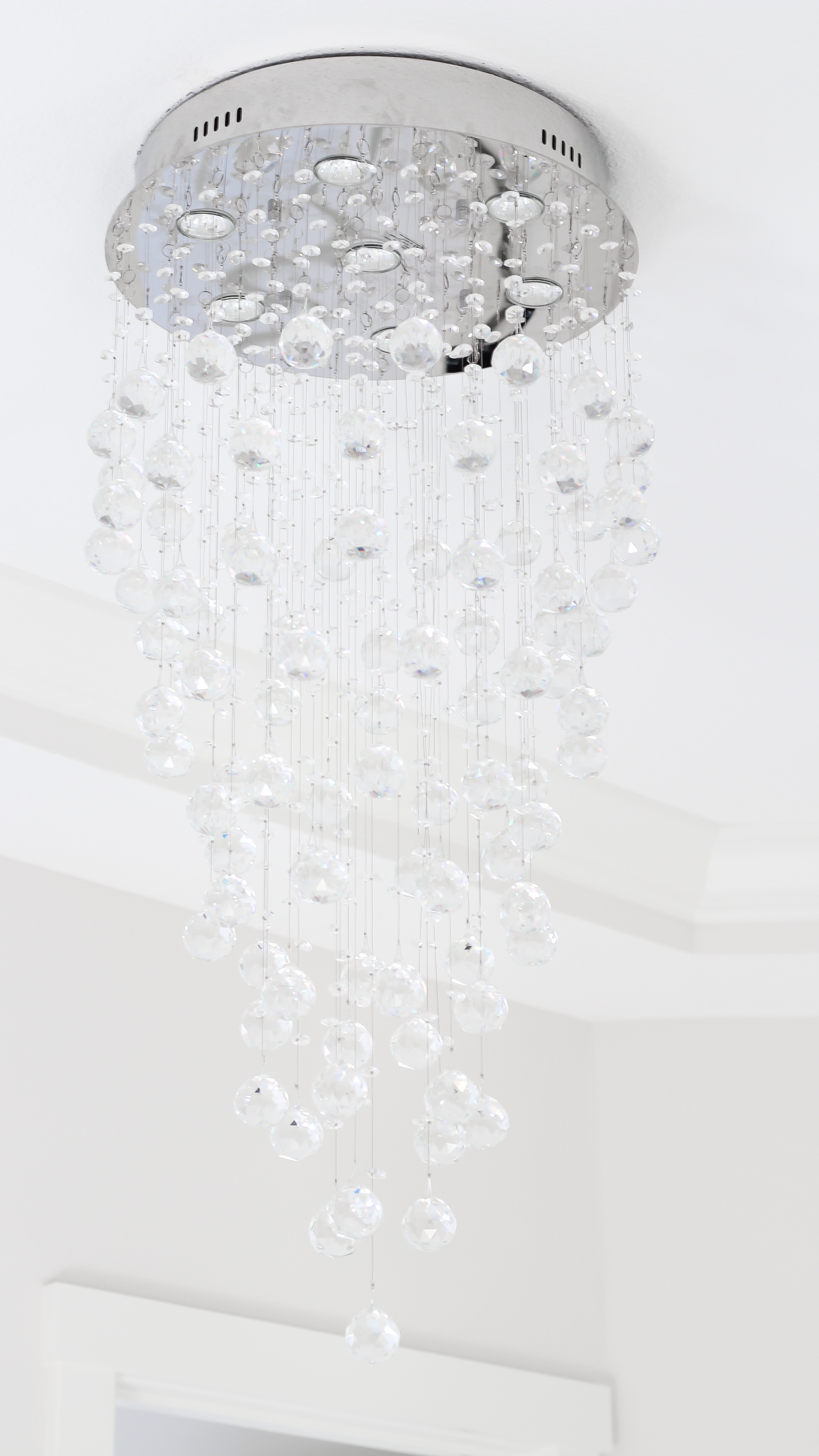
Hey guys! Today, I am sharing my favorite room in the #countrysidecustom with you, the master bathroom! I am SO in love with this room! It’s bright, clean, elegant and every homeowners dream…x10! If the kitchen & butler’s pantry amazed you, just wait until we break down all of the details from this room!
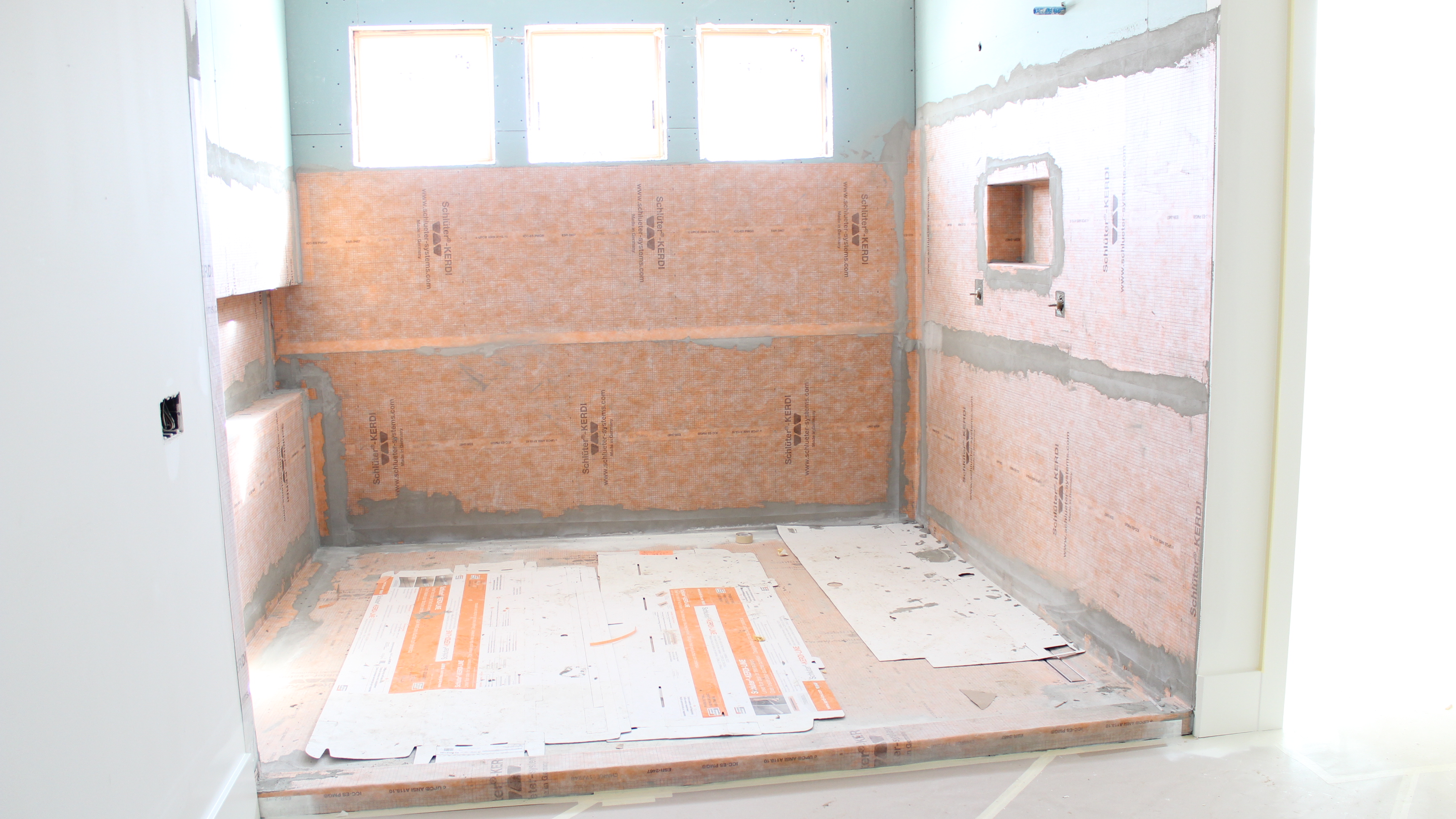
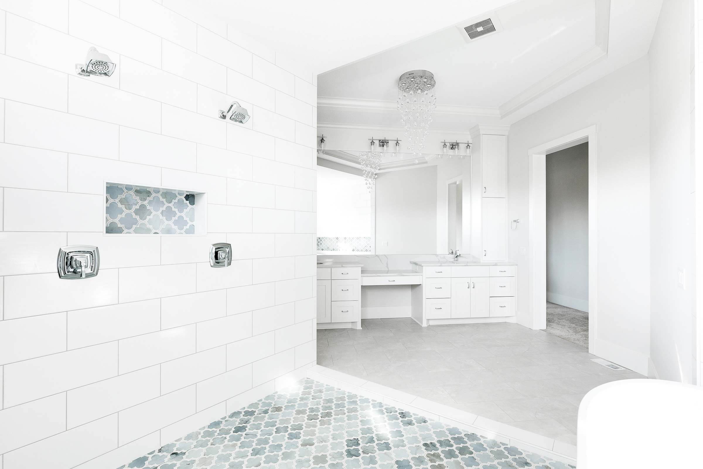
Let’s start with my absolute favorite part of the room, the wetroom…aka the gigantic shower and bathing space. It is a whopping 70SqFt, that’s the size of a small bedroom! That leaves plenty of space to not only shower, but dance, jump or do whatever the heck else you want! Because, I mean, with a shower like this one, how could you resist?
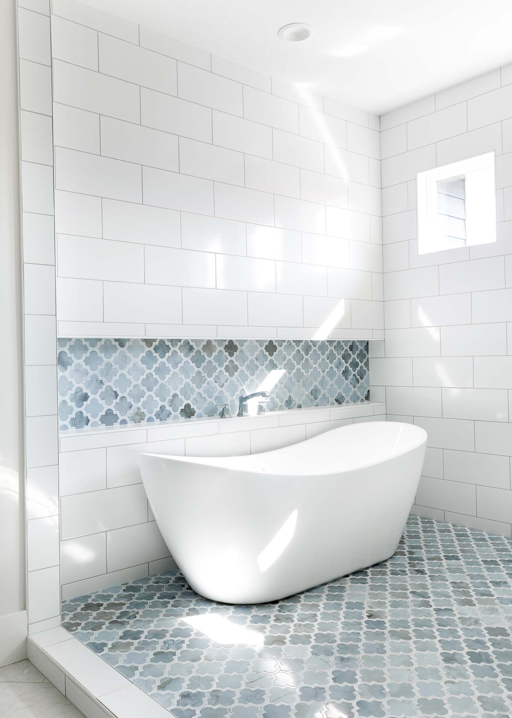
The wet room has two shower heads AND a freestanding tub. Say whaaat?! For the floor, we went with a marble in a fun arabesque/moroccan pattern from our friends at The Tile Shop — and it is an absolute show stopper! Another cool feature of the shower is the linear drain. Instead of using a center drain, like you commonly see, we chose to slope the floor all the way to the wall with the shower heads, and put the linear drain beneath it. This creates a much smoother floor with a drain that blends seamlessly into the shower floor – creating a much cleaner look.
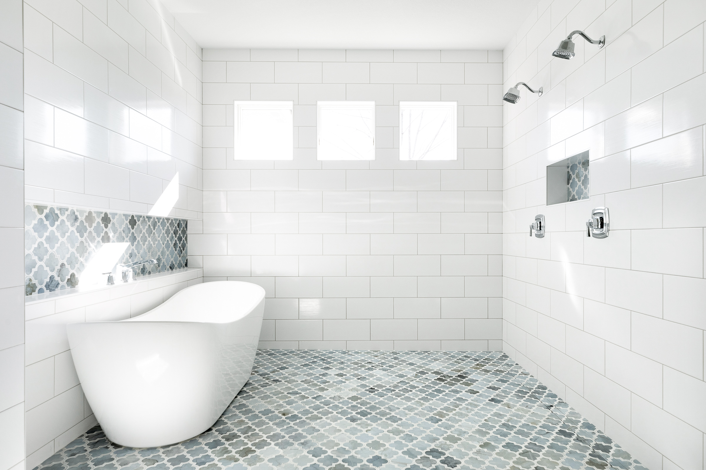

 A fun little tip for those of you considering a freestanding tub in your bathroom – the floor mounted fillers get to be CRAZY expensive. So look for a freestanding tub where you can either mount the faucet on the deck of the tub, or do what we did and add a ledge behind to mount the faucet on. Win win because not only is it more cost effective, but it creates a gorgeous focal point (that also functions as a place to put your soap & candles!).

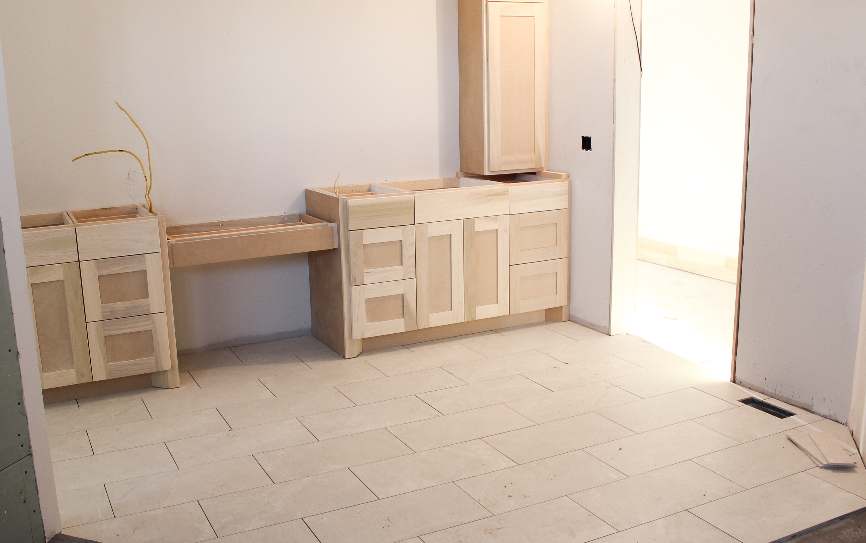
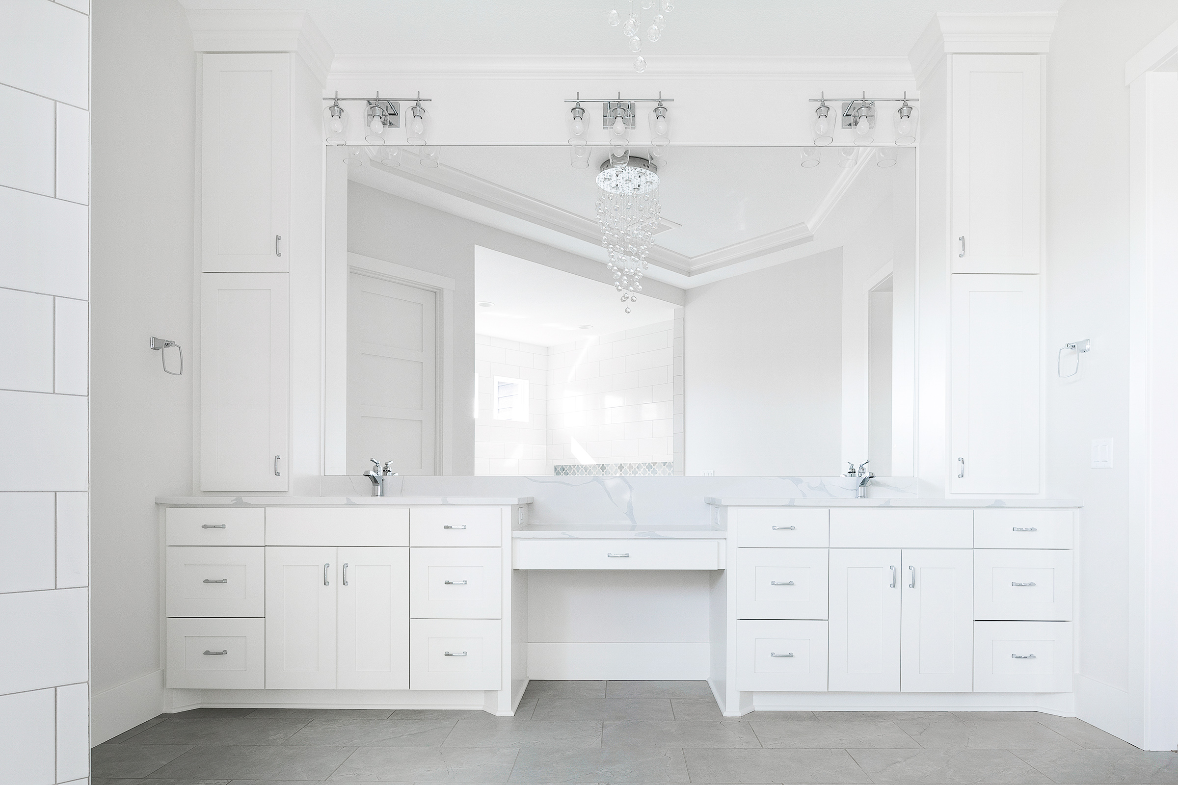
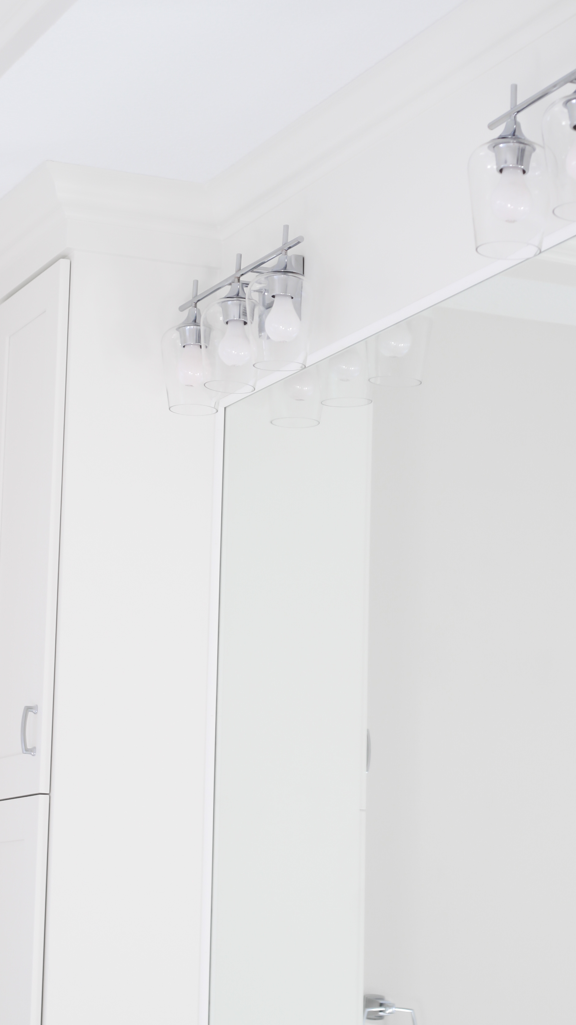
On the opposite side of the room is the double vanity. We wanted to keep everything clean, white, and bright, so we opted for shaker style cabinets and quartz countertops. I recommend quartz to my clients instead of marble because the material is a lot less prone to stains and scratches, but doesn’t sacrifice style. In the center of the vanity, we added a makeup station and drawer for our client. We lowered the counter space so she has the ability to sit down while getting ready.
Every inch of this bathroom turned out stunning…and I am SO happy with how everything turned out!

 Design: Alma Homes
Photography: Spacecrafting, Sarah Olfelt Photo, and Alma Homes


Can you share how large the niches are?
I must say that this bathroom looks really very beautiful. I would also like to own this kind of a bathroom for my own house. I will definitely try and replicate this bathroom in my own house. Thank you very much for sharing this bathroom design with us.
Your point of view caught my eye and was very interesting. Thanks. I have a question for you. https://www.binance.com/en/register?ref=JHQQKNKN