As you may know, we recently finished the #countrysidecustom, which still is a bit surreal given how quickly things came to fruition. We are ecstatic and can’t wait to give you the grand tour…BUT, before I get too ahead of myself, let’s start with everyone’s favorite room, the kitchen!
The kitchen is one of my favorite rooms to design because it makes SUCH an impact in your home. Not only is it visually the star of the show, but functionally, it’s where most people spend majority of their time. So it HAS to work. It’s the place where family and friends gather, where you cook…and where you do your happy dance!


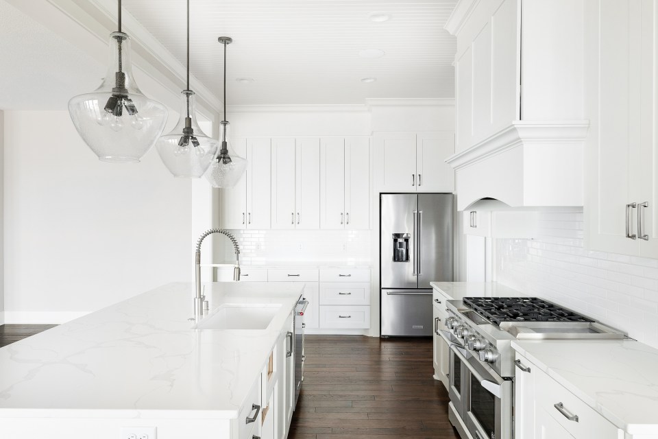
Our clients wanted to go with an all white kitchen, and I was all over that idea! We opted for a white shaker style cabinet, quartz countertops and an elongated subway tile for the splash. My number one rule of thumb when it comes to designing a white kitchen is to make sure you include different textures (which we did through the beadboard, backsplash, and counters). This helps to add interest and personality and keep the kitchen from feeling boring. Plus, you can spruce it up with chic hardware, stylish light fixtures, and fun accessories.

The faucet from Moen is definitely a focal point in this kitchen — spring faucets have been all the rage with our clients lately! And for those of you wondering what those weird things are on either side of the faucet, well have I got an answer for you. The button to the right of the sink is called an air switch, which controls your garbage disposal. I love this little guy because instead of having to open the cabinet doors with grubby hands to turn on the disposal, you just have to push a little button, and viola! Magic. On the left side of the faucet is what’s called an air gap. This defffffffinitely is not my favorite thing in the word. In fact, I kind of wish it didn’t exist. Basically, it’s a vent for the dishwasher that Minnesota now requires for code. Soooo unfortunately, there’s no getting around that one. 🙁
For the sink, we chose a quartz undermount sink from Elkay. This is always one of my go-to’s when it comes to kitchen sinks because it’s clean, seamless, and is just so darn pretty!


Our clients also wanted convenient access to some of their most frequently used items, so, we designed the cabinets accordingly! We added a built in paper towel holder (that pulls out for more paper towel storage — GENIUS!!), as well as pull out baskets for storing potatoes & onions. Not only does this add function, but it looks adorable and breaks up the white cabinetry! To the left of that bank, you can see four slots for cutting boards; these are a quick reach away and easily accessible when you’re hustling around the kitchen.


The final (and possibly my favorite) feature of this kitchen is this incredible range from our amazing friends over at Warners’ Stellian…talk about gorgeous! They chose a KitchenAid range with a double oven and griddle, SO MUCH ROOM FOR COOKING!! Pro style ranges are definitely one of my all time favorites. I love how substantial they are, and I like that it’s a little different than the traditional double wall ovens you so frequently see.
So there you have it! We are so happy with how this kitchen came together! It looks, clean, pristine and is all move-in ready. We will be sharing more of this house tour throughout the rest of this month, so if you aren’t already, be sure to follow along with us on Instagram for more photo’s, inspiration and updates!


Design by: Alma Homes
Photography: Spacecrafting Photography, Sarah Olfelt Photo, Alma Homes


