Moody paint colors have been having a major moment—and for good reason. Deep, rich hues instantly elevate a space by adding warmth, drama, and depth that lighter neutrals can’t always achieve. Whether you want a cozy office, an elegant dining room, or a statement-worthy mudroom, these moody tones can completely transform your home’s atmosphere. So here are some of our favorite shades we’ve used (and loved!) in our own projects—and a few designer-approved picks worth trying.
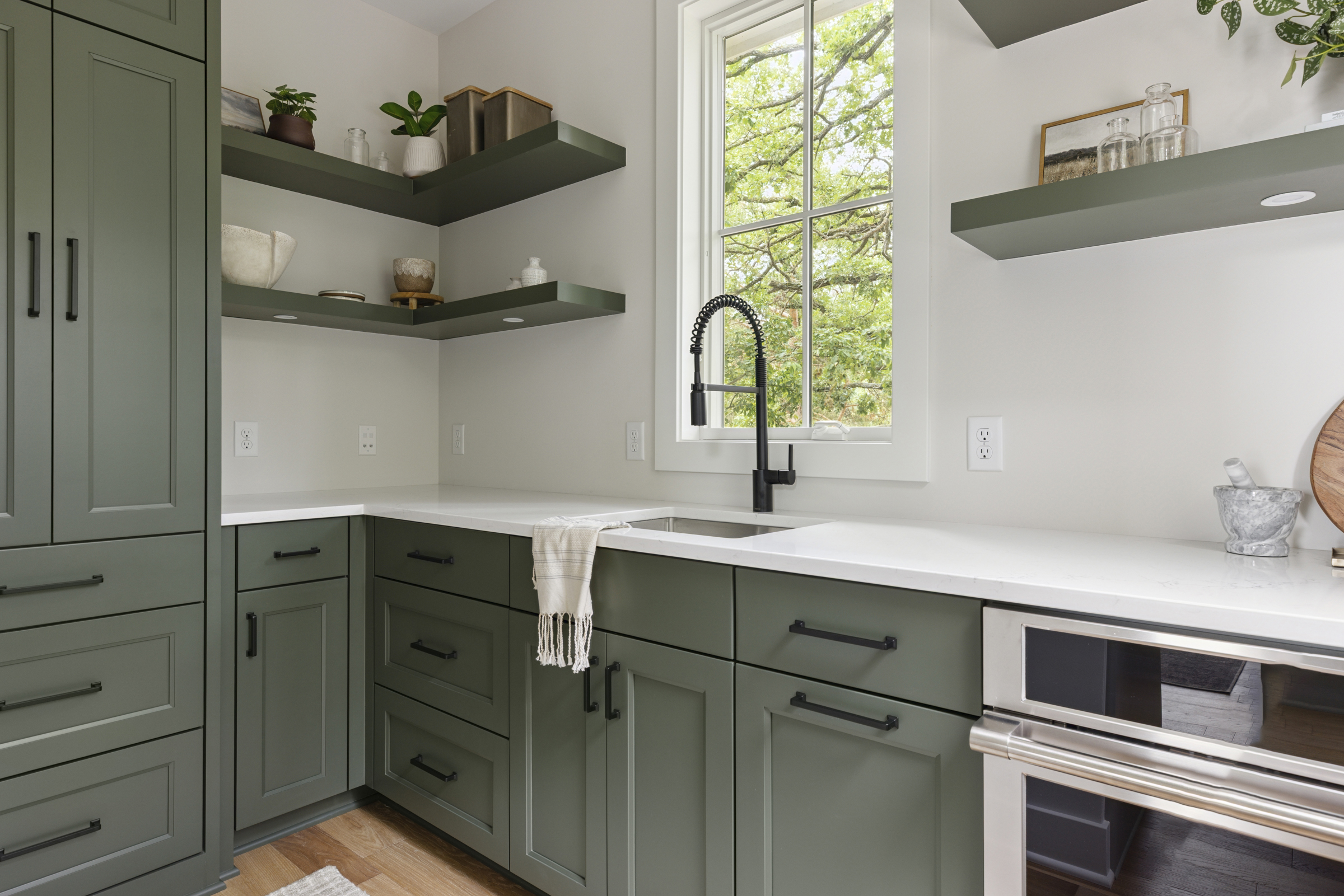
Vintage Vogue By Benjamin Moore 462

Used in the mudroom at #BurnsvilleBuild, Vintage Vogue is a timeless green with just the right amount of depth. It feels earthy and classic without being too dark. This shade pairs also beautifully with warm metals, natural wood tones, and crisp white trim—perfect for spaces that need a sophisticated yet welcoming vibe.
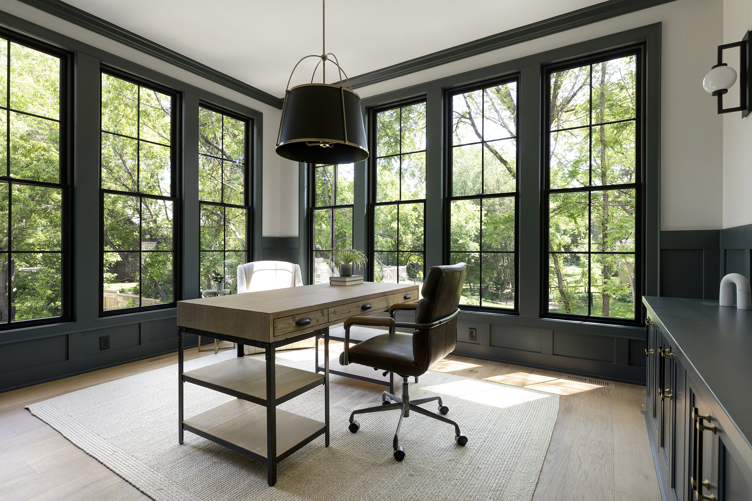
Midnight Blue By Benjamin Moore 1638

We used Midnight Blue in the office at #TheArtemisHouse, and it completely changed the mood of the space. The color has a rich navy base with a touch of gray, giving it an obviously calm and grounded feeling. It’s a great option for offices or libraries where you want focus and sophistication without feeling heavy. Also, wood and leather accents pop next to it!
Oakmoss By Sherwin Williams 6180

Seen in the dining room at #TheArtemisHouse, Oakmoss is a warm, olive green that indeed brings a cozy, organic touch to any room. It looks stunning paired with warm brass fixtures and natural textures such as linen drapes or a jute rug. For an elevated twist, consider using it in a moody powder bath or as an accent color on cabinetry.
Midnight By Benjamin Moore 2131
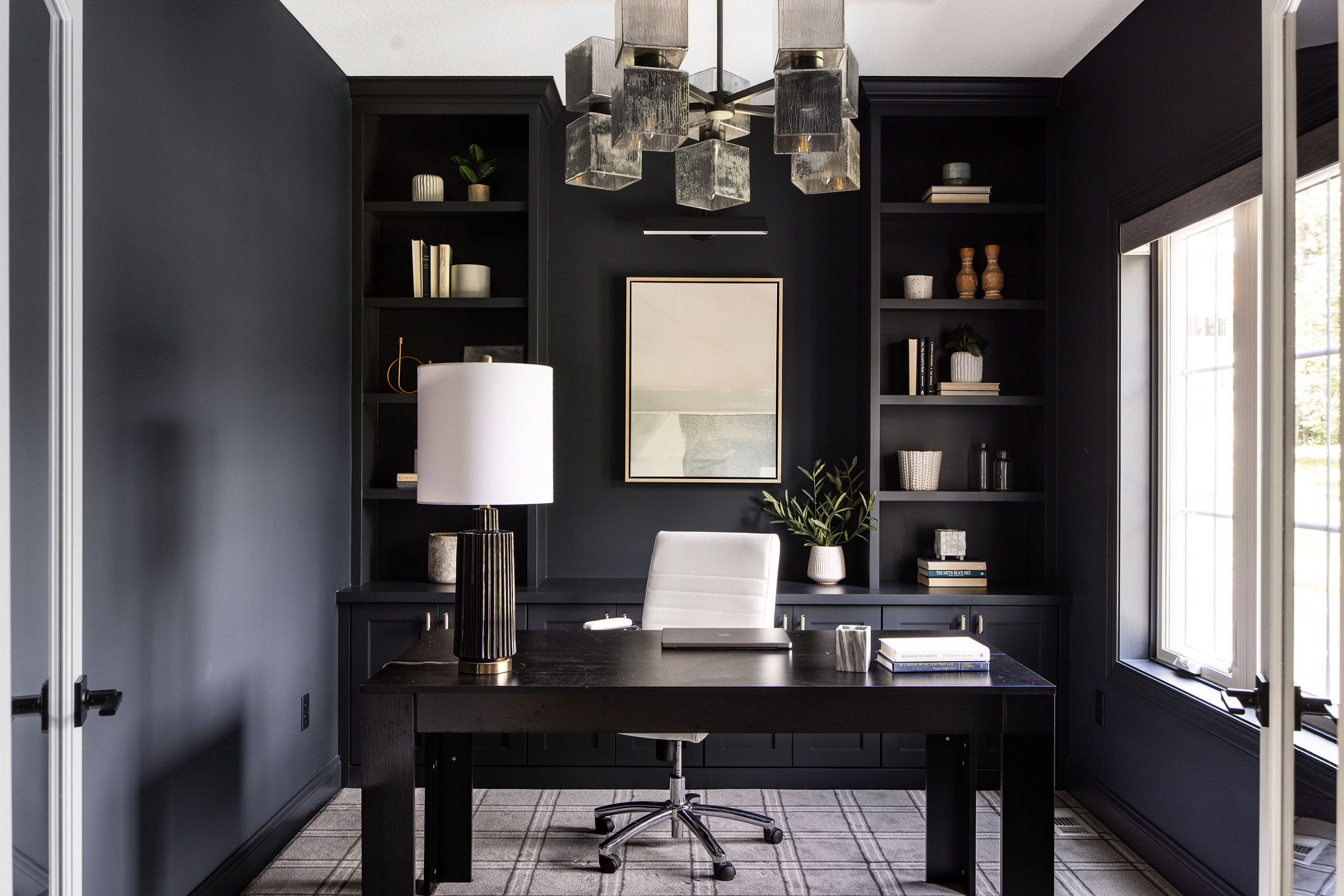
At #MoundMiniMansion, we used Midnight in the office because it’s the perfect blend of charcoal and navy. This shade adds instant depth and luxury, especially when paired with neutral decor or rich wood tones. It’s moody in the best way since it is bold yet balanced.
Fading Twilight by Benjamin Moore 1258

Fading Twilight is a warm, reddish tone with a moody depth that feels both rich and inviting. It brings an old-world charm that works beautifully in more intimate spaces like dining rooms, libraries, or music rooms. The color’s subtle red undertones add warmth and character, especially when paired with brass, cream, or deep green accents.
Stonecutter By Benjamin Moore 2135-20
Used in the office at #BloomingtonBuild, Stonecutter is a deep charcoal with cool undertones, creating a modern atmosphere. It pairs beautifully with clean-lined furniture and matte finishes and is ideal for contemporary spaces where you want to feel grounded.
Urban Bronze By Sherwin Williams 7048
In the lower level living room at #BloomingtonBuild, Urban Bronze gives a rich, cocooning feel that’s both modern and cozy. It’s a complex brown-gray with a hint of warmth, making it perfect for larger spaces that can handle a dramatic tone. It also complements natural stone, wood beams, and layered textiles beautifully.
Cola By Farrow & Ball No. 9918
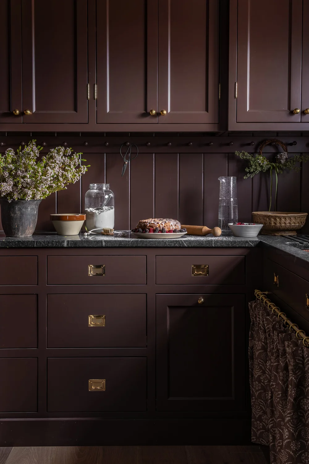
Cola is a deep, reddish-brown that feels nostalgic yet bold. It’s the perfect choice if you want to step away from traditional dark grays or greens and lean into something with a bit of vintage charm. Pair it with brass hardware and warm lighting for a luxe, inviting look.
In short, moody paint colors can make your home feel layered, intentional, and full of personality. The key is balance—pair darker hues with light flooring, reflective finishes, or plenty of natural light to keep your space feeling cozy instead of cave-like. Whether you go bold in a small powder bath or embrace drama in a full dining room, these rich shades prove that a little mood can go a long way.
Looking for more home-related tips, tricks, and resources? Join our email list for the latest and greatest Alma Homes updates, and follow us on Instagram for more inspiring home and design content.
Love our website? Use code ALMAHOMESSENTME for 10% off any Tonic Site Shop website template.