


Can we start by saying that choosing our top favorite paint colors of 2021 was a simple, yet challenging request all in one! We have SO many new favorite paint colors that we love, but the five colors we selected are gorgeous and timeless shades that you can’t go wrong in using. From white paint to blue paint and all the neutral shades in between, we found ourselves recommending these go-to shades more than most in 2021. Scroll through our picks below and let us know if there’s a shade you loved that we might be missing out on trying!
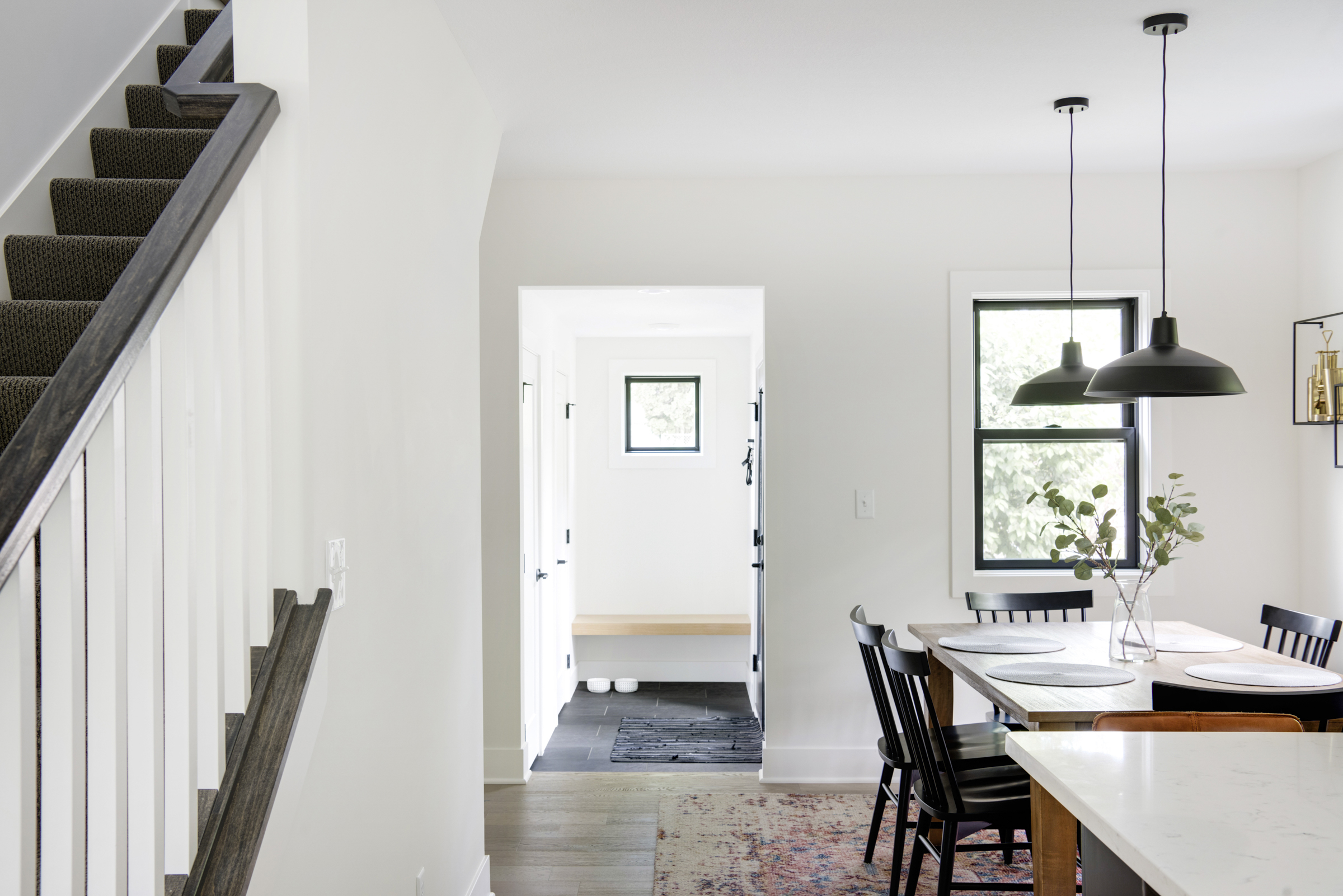
BM White Dove OC-17
At the top of our list and perhaps our most used is Benjamin Moore’s, White Dove. This softly shaded white has a warmer undertone but doesn’t come off yellow. It’s a light and luminous white that we simply can’t stay away from!
BM Classic Gray OC-23
For us, Classic Gray is the chameleon of neutrals. We love using it as a soft neutral that works as a base for any decor style. While this is a universal shade, it still offers the perfect amount of contrast against white trim. We’ve used it in the #thetonkahouse, the #raspberryhillhouse, and #thetreehousereno, and we love how versatile it is!
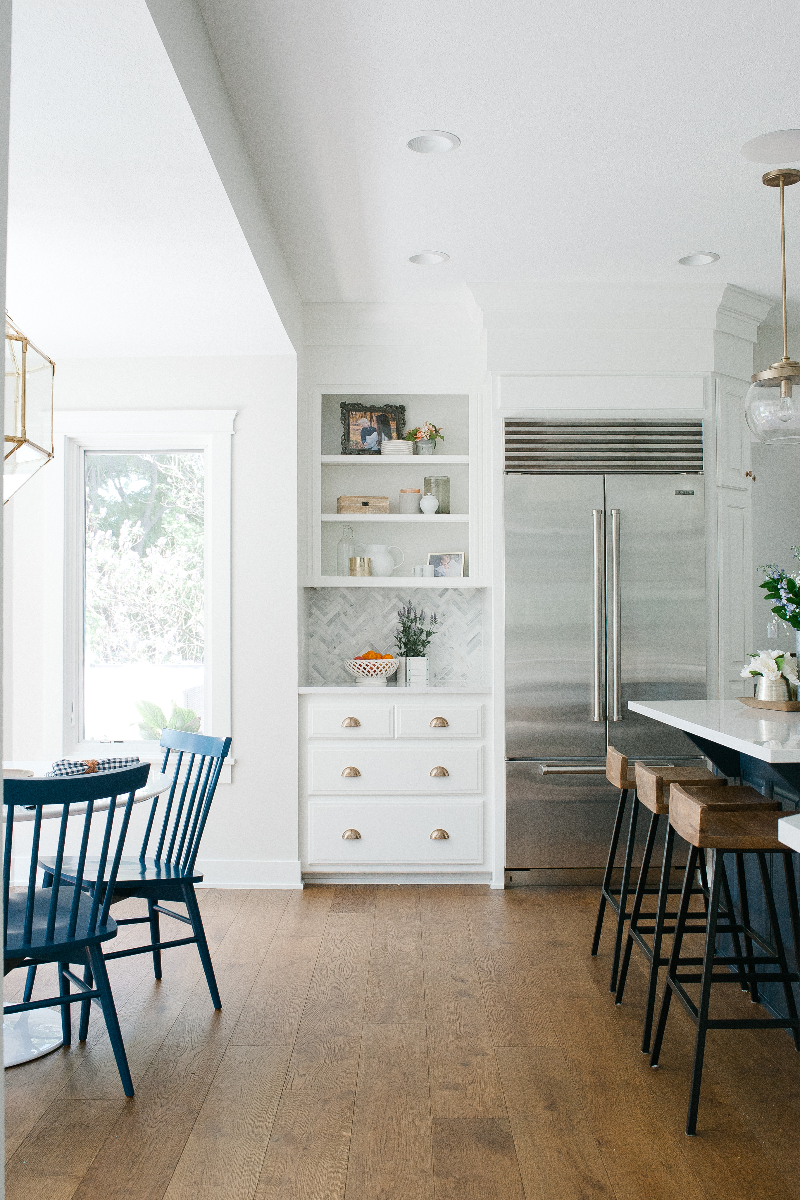
Accessible Beige SW 7036
We always get asked what paint color we used in #thelakeloft kitchen, leading us to respond Accessible Beige WAY more than we imagined this year. This shade is one of the most popular Sherwin Williams paint colors because of its versatility inside and outside the home. Accessible Beige is a light warm, greige paint color that we recommend to almost all our clients!
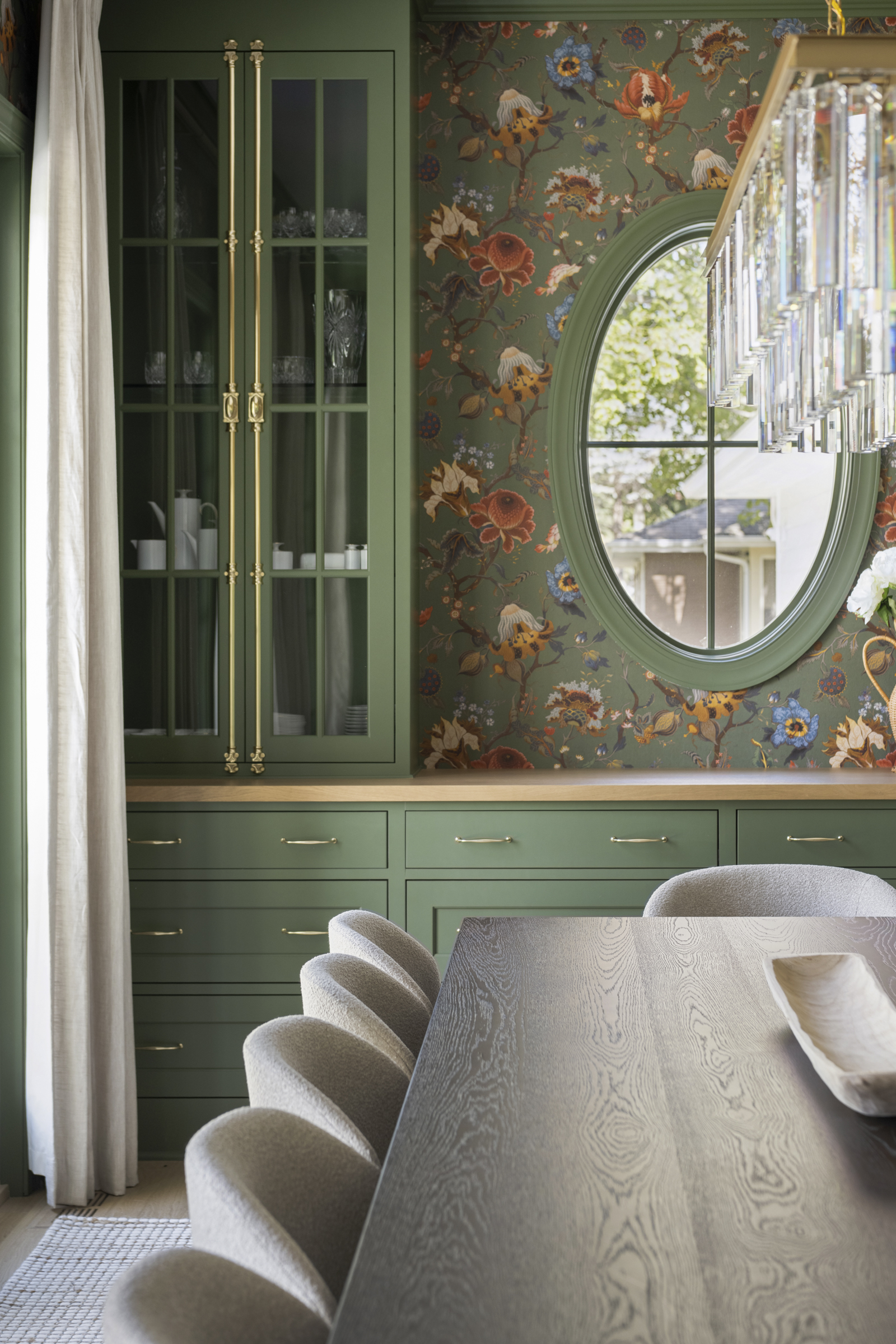
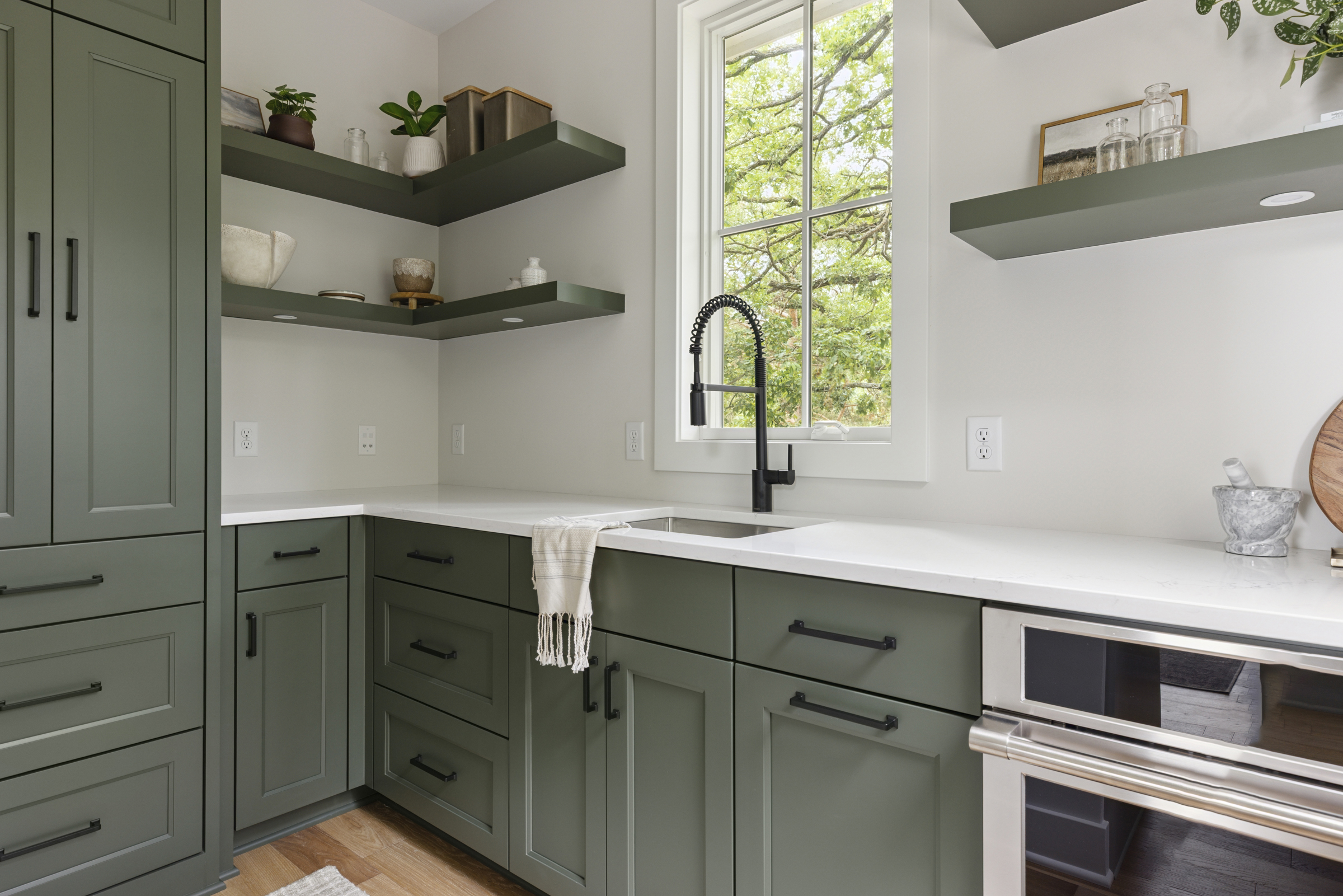
Farrow & Ball Pigeon
We may be biased, but Farrow & Ball’s Pigeon shade is our go-to grey-green paint color. This shade evokes cozy and soft feelings and finds its name after the color of the pigeon bird. It brings out the vibrancy of brass material and matches pewter and greys beautifully. If you’re looking to incorporate a touch of green into your home, this shade is for you.
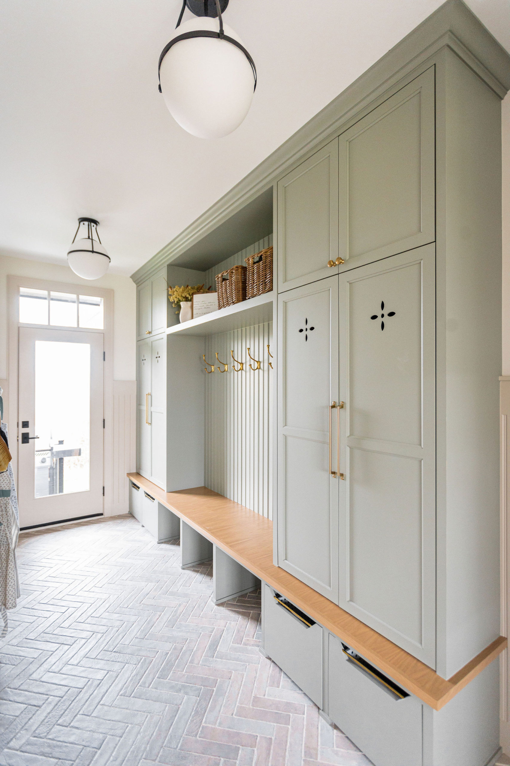
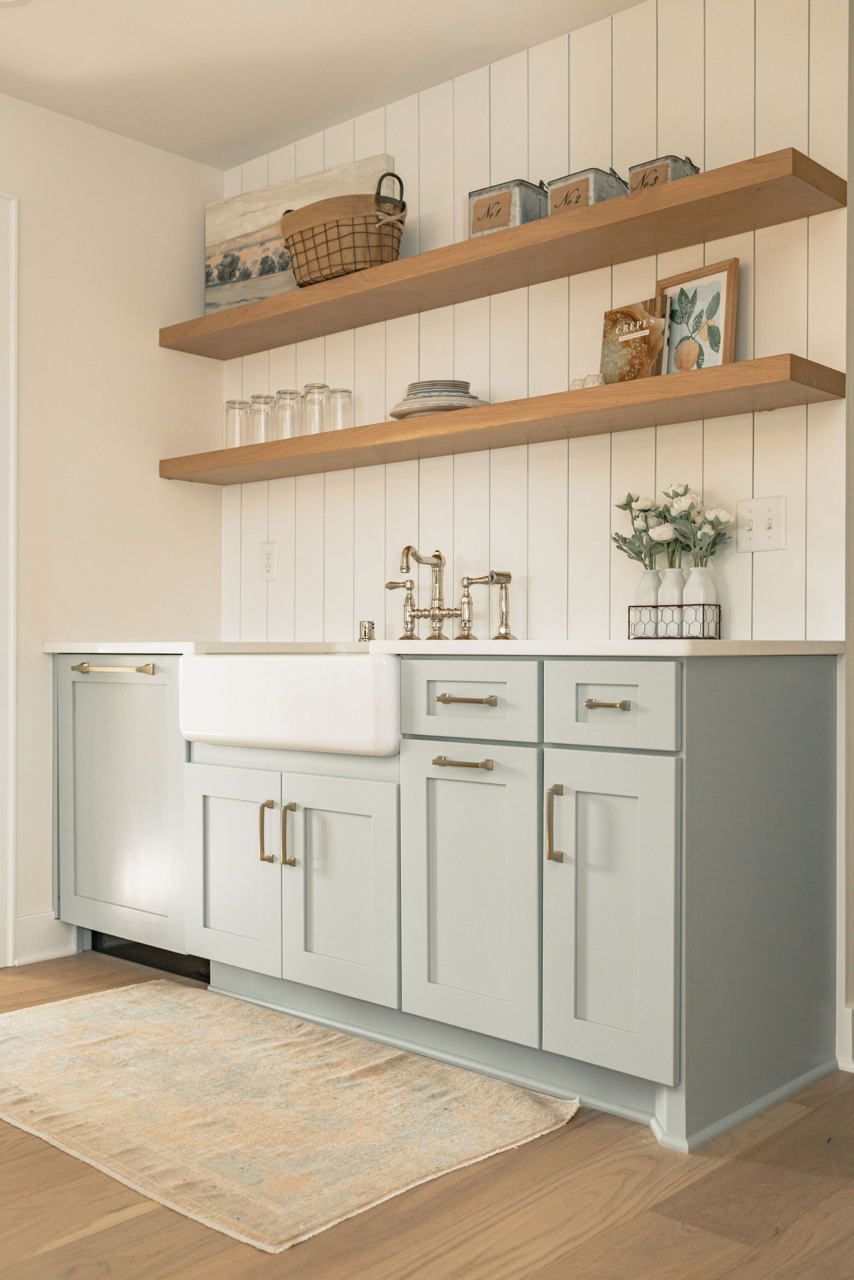
BM Iced Marble 1578
If you’re looking for a more classic and elegant shade of blue, we’re a sucker for Iced Marble! As part of the Benjamin Moore Classic Color Collection, this shade guarantees beautiful, usable color all the time. We highly recommend Icy Marble as a pop of muted color for cabinetry in mudrooms and laundry rooms, as we did at #thelakeloft.
MORE PAINT COLOR ROUNDUPS
THE BEST BLACK PAINT COLORS FOR YOUR HOME
THE BEST NAVY PAINT COLORS FOR YOUR HOME
THE BEST GREY-GREEN PAINT COLORS FOR YOUR HOME
THE BEST LIGHT BLUE PAINT COLORS FOR YOUR HOME


Your point of view caught my eye and was very interesting. Thanks. I have a question for you. https://accounts.binance.com/en/register?ref=P9L9FQKY