
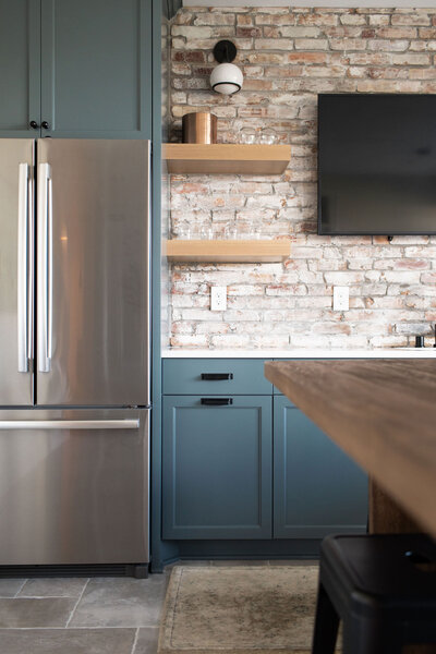
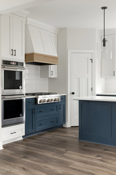
Ever wondered why certain rooms can shift how you feel? The answer might literally be written on the walls. Most of our clients are shocked to discover that their paint color choice can actually affect their mood. Beyond picking colors you like, it’s important to consider space suitable paint options that align to the intended use of the room! Today we’re breaking down four popular colors and the emotional responses they tend to evoke.
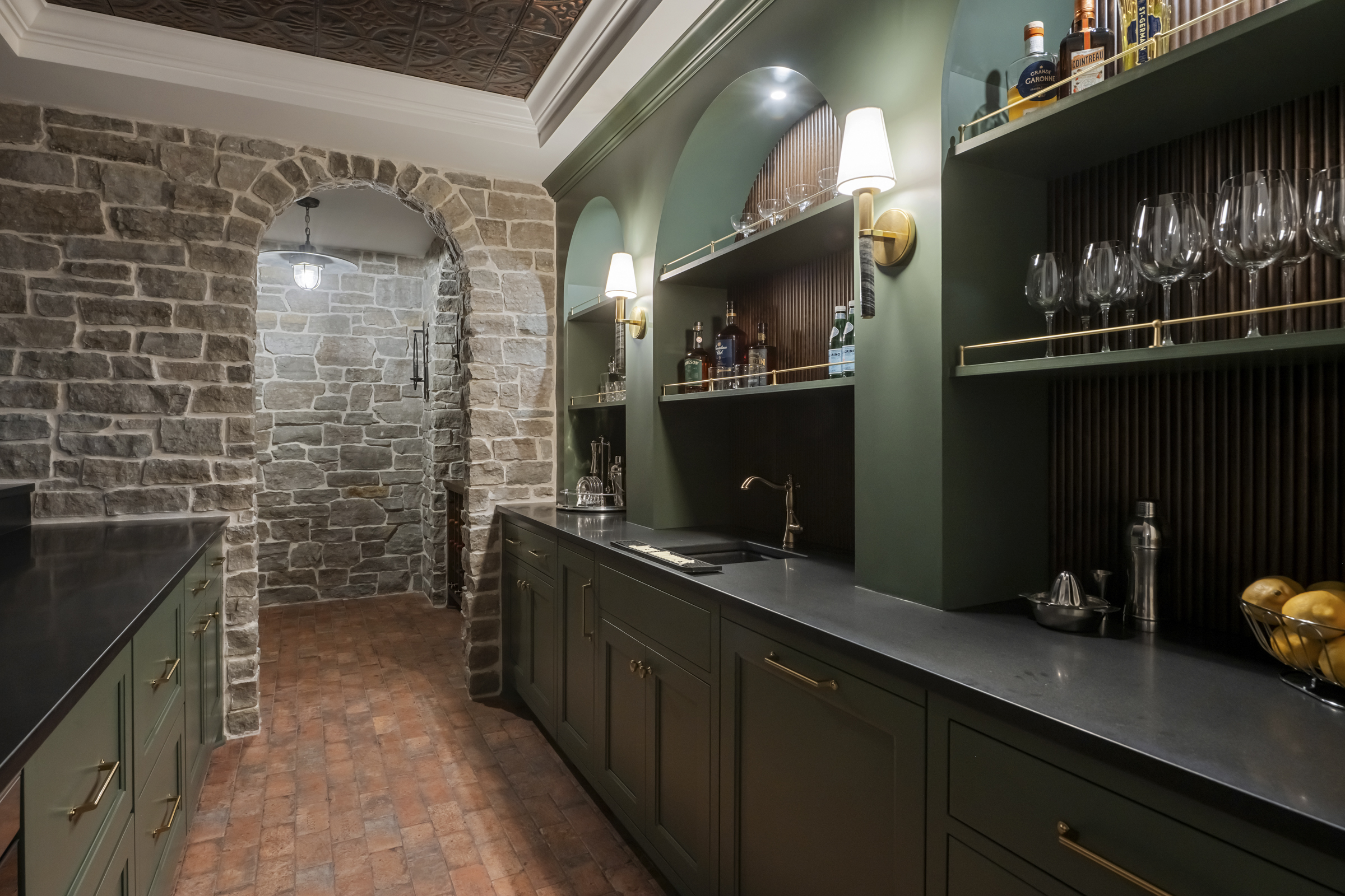
Green: Balance and Relaxation
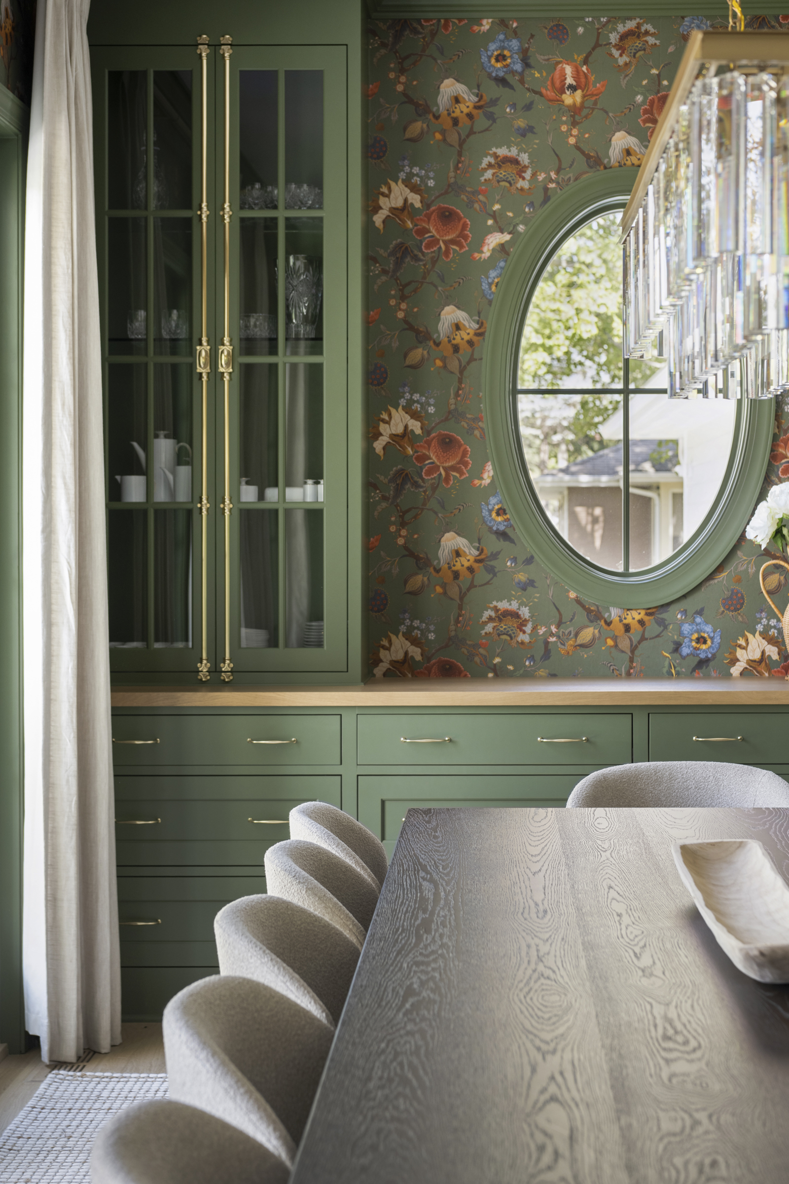
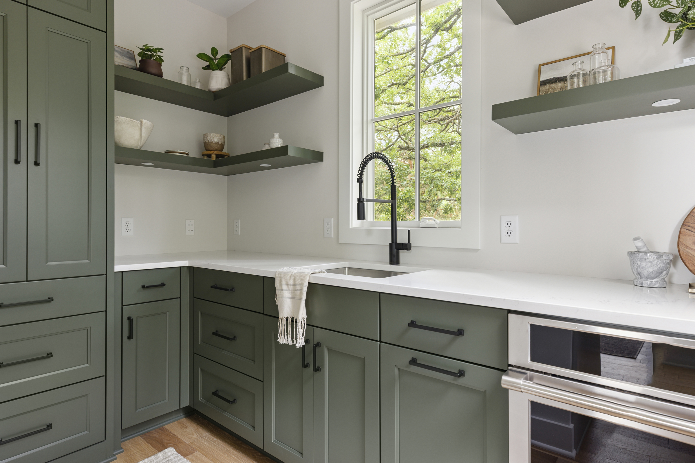
Green is closely tied to nature, and it tends to evoke calm, balance, and a sense of renewal. It’s considered one of the most restful colors for the eye, which is why it shows up so often in spaces meant for relaxation, connection, or focus.
One thing to keep in mind: the tone of the green matters here! Softer greens with brown undertones tend to be more soothing and grounding, while brighter greens with yellow undertones can lean energizing.
Yellow: Energy and Optimism
Yellow is the color of sunshine, and it tends to carry that same warmth and brightness into our emotions. It’s associated with happiness, optimism, and mental stimulation, often used to spark creativity or grab attention. In interiors, a soft yellow can be perfect for spaces that you want to feel cheerful and welcoming, like a kitchen, breakfast nook, or dining room.
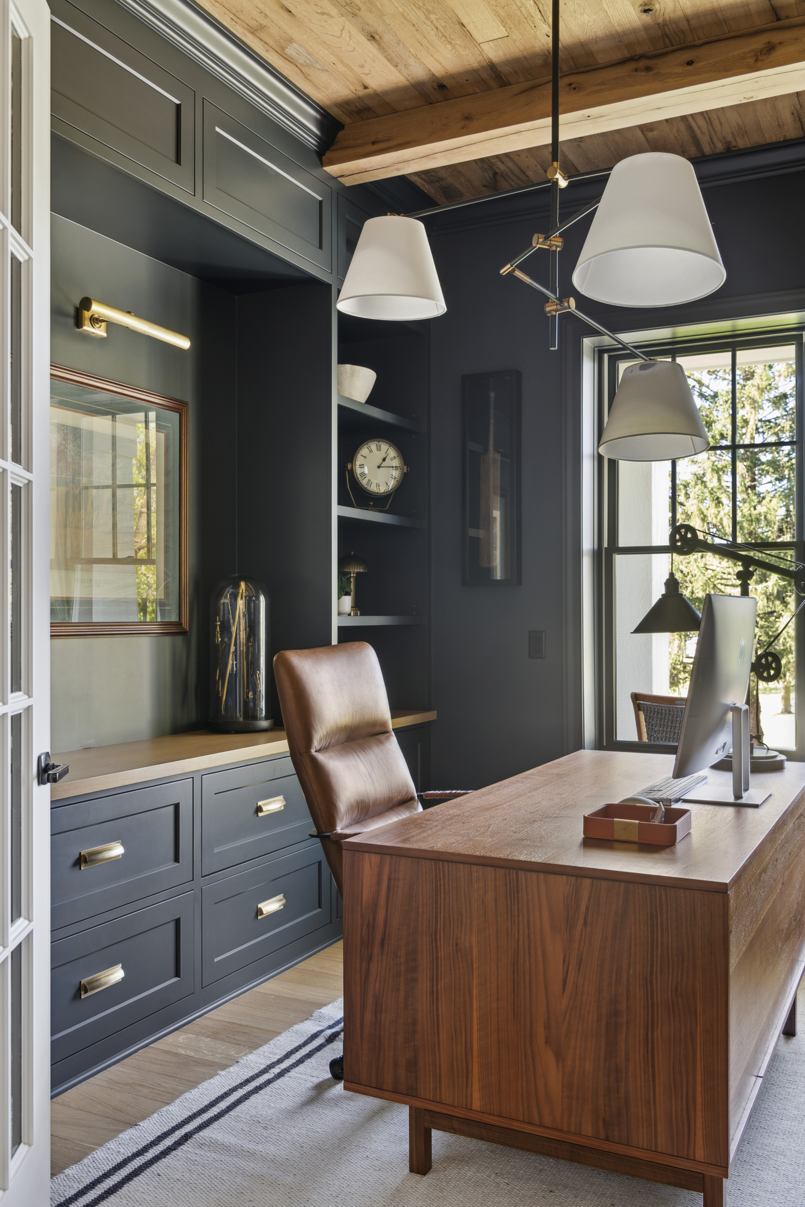
Blue: Calm and Trust
Blue is consistently rated as one of the most universally liked colors, and it’s strongly linked to feelings of calm, stability, and trust. It has a naturally cooling, soothing effect, which is part of why it’s such a common choice for home offices and other spaces requiring level-headedness.
Pink: Comfort and Warmth
Pink softens a space in a way few other colors can. Lighter shades tend to feel nurturing, comforting, and gentle, while deeper or more saturated pinks can bring in playfulness and warmth. Depending on the shade, it can be a popular choice for spaces designed to feel intimate or welcoming like nurseries, powder rooms, or guest bedrooms.
None of these colors exist in a vacuum. The emotional impact of color is also shaped by shade, saturation, lighting, and the colors surrounding it. But understanding these baseline associations gives you a helpful starting point when choosing a palette, whether you’re designing a single room or an entire home. The right color doesn’t just look good; it helps a space feel the way you want it to.
Looking for more home-related tips, tricks, and resources? Join our email list for the latest and greatest Alma Homes updates, and follow us on Instagram for more inspiring home and design content.